
Before the Orchestra Begins, the Oboe Gets One Note
That solitary A before a concert is not a warm-up. It is a compact negotiation among history, acoustics, weather, and dozens of instruments that refuse to stay put.
Before an orchestra plays anything by Beethoven, Beyoncé, or a composer born last Tuesday, it usually performs one very old piece: a single A. The hall has been full of scattered scales and bright little fragments. Then the concertmaster stands. An oboe sends out one narrow, unmistakable note, and the noise gathers around it. Strings answer. Winds answer. Brass answer. For a few seconds, dozens of specialists agree to become one instrument. The obvious question is why the oboe gets to make the offer. A popular answer is that the oboe is exceptionally stable. Another is almost the opposite: the oboe is difficult to tune quickly, so everyone else has to meet it where it is. Both explanations contain something useful, but neither turns the custom into a law of nature. The oboe became the orchestra’s reference through a mixture of history, audibility, and practical inconvenience. Early orchestras of the late 1600s were largely built around strings. Oboes sometimes reinforced violin lines and soon acquired independent parts of their own. Their sound was bright enough to be heard through a growing group of string players, and their pitch was more dependable than the gut strings then in use. They were also commonly present. A reference instrument is not much help if it has the evening off. The instrument’s construction helped fix the arrangement. An oboe makes sound when air sets two thin pieces of cane vibrating against each other. That double reed gives the instrument its concentrated tone, but it also makes pitch adjustment a delicate business. Yamaha’s instrument guide notes that an oboist cannot simply change pitch by sliding a barrel, as a clarinetist can, or by turning a tuning peg, as a violinist can. Meaningful adjustment often involves the reed itself: its length, width, scrape, or position. This does not mean an oboe is incapable of playing sharp or flat. It certainly is. Nor does it mean every oboe wakes up each morning at a cosmically ordained frequency. Reeds react to conditions, players compensate, and instruments warm during use. The better way to put it is that an orchestra traditionally organizes itself around the oboe because the note is conspicuous, the instrument has long occupied the right place in the ensemble, and last-second mechanical adjustment is limited. The ritual also reveals how surprisingly mobile musical pitch can be. Temperature and humidity affect instruments. Strings stretch and settle. Wind instruments change as the air column and instrument warm. Mutes can alter pitch slightly. An orchestra is not a cabinet of calibrated rulers; it is a temporary weather system made of wood, metal, cane, gut or synthetic strings, breath, and hands. So the tuning A is less a declaration than a local agreement. Many modern orchestras use an A near 440 hertz, meaning 440 vibrations per second, while some favor a slightly higher pitch such as 442. If a fixed-pitch instrument such as a piano or organ is involved, that instrument may settle the matter first, because it cannot be conveniently retuned between the overture and intermission. The oboist then carries that pitch to everyone else. Why A? Every instrument in the orchestral string family has an A string, making it a practical common denominator. The concertmaster—the first-chair violinist who acts as a liaison between conductor and ensemble—typically initiates the process. Depending on the orchestra, sections may tune in groups rather than all at once. What sounds to the audience like a splendid swarm is actually orderly traffic. Electronic tuners have not made this obsolete. A device can tell each player whether a note matches a numerical target, but an orchestra must do more than assemble individually correct readings. Musicians need to hear the same pitch in the same room, after their instruments have warmed, and adjust to one another. Acoustic tuning also exposes interference beats: the audible pulsing produced when two nearly matching frequencies meet. As the notes converge, the pulsing slows and disappears. And the oboe is not sovereign everywhere. If a score has no oboe, another wind instrument may give the note. A string-only ensemble can tune from the concertmaster. Concert bands often use B-flat because it lies naturally on many band instruments. The custom is a tool, not a monarchy. Still, it survives because it does several jobs elegantly. It checks the machinery. It gives players a final shared reference. It draws a clean boundary between the sociable disorder before the concert and the attentive silence after it. The conductor has not yet lifted a baton, but the room has already changed state. That lone A is often described as the orchestra getting “in tune.” More precisely, it is the orchestra deciding what “in tune” will mean here, tonight, under these lights, with this reed and these strings. The first act of a performance is not expression. It is agreement.

Your Jeans Are Still Wearing a 153-Year-Old Repair
Those tiny metal dots on denim began as a practical answer to pockets that kept tearing—and became one of clothing’s most durable pieces of visible engineering.
The smallest pieces of a pair of jeans may be doing the most honest work. At the corners of the front pockets, where cloth changes direction and hands tug thousands of times, little metal disks clamp the layers together. They are not buttons, and they are not merely decoration. They are a repair that became part of the original design. The relevant document is U.S. Patent No. 139,121, granted on May 20, 1873. Its title is magnificently unromantic: “Improvement in Fastening Pocket-Openings.” The drawing shows a pair of trousers with small circles at the ends of the pocket openings. The circles look almost exactly like the rivets still staring from a modern pair of jeans. The patent named Jacob W. Davis of Reno, Nevada, as the inventor and assigned the invention to Davis and Levi Strauss & Company of San Francisco. Its problem statement could fit on a repair ticket today. Pocket seams, Davis wrote, were prone to ripping because putting hands into pockets placed pressure and strain on the thread. His answer was to pass a metal rivet, eyelet, or equivalent stud through the cloth at the end of the seam and head it down so the two pieces were firmly united. This was not an attempt to make all sewing obsolete. It was a precise intervention at a weak point. A pocket opening is a small mechanical drama: soft fabric must flex, the seam must hold, and the corner must absorb a force concentrated into a tiny area. Thread is good at joining long edges. A rivet is good at keeping stacked layers from pulling apart at one highly stressed spot. The patent is careful about the distinction. Davis described the metal fastener as preventing strain or pressure from falling on the sewing thread. That is why rivets appear at particular corners rather than marching around the garment like armor. The idea was not “metal trousers.” It was “help the thread where the thread suffers most.” There is something appealingly legible about this arrangement. Most improvements in modern clothing are hidden in fiber chemistry, automated cutting, stretch blends, coatings, or supply chains. A rivet explains itself. Look at where it sits, imagine a hand entering the pocket, and the design decision becomes visible. The object carries its own diagram. It also carries a trace of the garment’s original category. Riveted trousers are now casual uniform, fashion canvas, office wear, and occasionally an expensive object sold with solemn language about fading. But the 1873 patent is concerned with durability and mending. Davis says the fastener avoids “a large amount of trouble” repairing seams under constant strain. Before blue jeans became shorthand for cool, rebellion, youth, or America, the rivet’s argument was simpler: this part keeps breaking. Let us stop that. Even the patent’s limits are revealing. Davis acknowledged that rivets had already been used in shoes. His claim was not to have invented the rivet, a technology far older than denim, but to apply a metal fastener in this particular way to pocket openings. Many durable inventions work like that. They do not summon a new material from nowhere. They move a familiar solution across a boundary and place it exactly where a recurring failure occurs. That move helped create an unusually persistent visual feature. Garment hardware normally tries to disappear into function: hooks hide, snaps close, zippers tuck under flies. Jeans rivets remained exposed. Once visible, they could do two jobs. They could reinforce the pocket and signal toughness, even to someone who had never lost a seam to repeated strain. The engineering became an emblem of engineering. The original patent has long since expired, of course. Its legacy is not legal exclusivity but repetition. The same tiny circles recur across brands, cuts, prices, and decades. They are copied so widely that they can seem inevitable, as though denim naturally grows copper-colored spots at the corners. It does not. Someone noticed a specific failure, borrowed a fastening method from elsewhere, and documented the fix in two pages of patent prose and drawings. This is the quiet bargain of a good everyday design: it can become so familiar that the problem it solved vanishes from memory. The pocket survives; the torn seam becomes hypothetical; the repair is mistaken for ornament. More than a century and a half later, the rivet is still there, calmly taking the strain—and still showing us exactly why.

A Cat’s Pupil Is Built for the Pounce
A cat’s vertical pupils do more than control brightness. Their shape may help a low-slung hunter judge the final, crucial distance to its prey.
A house cat’s eyes can perform a transformation that human eyes cannot. In dim light, the pupils open into dark, nearly circular pools. In bright light, they contract into narrow vertical seams. The familiar explanation is simple: the slit works like a precision aperture, admitting enough light at night without overwhelming the eye at noon. That is true, but it leaves a more interesting question unanswered. Why is the slit vertical rather than horizontal—or diagonal? A 2015 study in Science Advances proposed that pupil shape is not merely a dimmer switch. It is also connected to how an animal moves through the world, finds food, and avoids becoming food. The researchers compared 214 land species and found a striking pattern. Vertical pupils were strongly associated with ambush predators active across day and night. Horizontal pupils were common among plant-eating prey animals with eyes at the sides of their heads. Round pupils appeared more often in predators that actively chase their quarry. Cats belong to the first group, but not all cats do. Domestic cats and many other small, low-to-the-ground hunters have vertical slits. Lions and tigers have round pupils. That difference matters because the proposed advantage of a vertical pupil is not simply “better hunting.” It is particularly useful for an animal crouched close to the ground, waiting quietly and then launching itself over a short distance. To pounce accurately, a predator must estimate distance. Vision has several ways to supply that estimate. Binocular disparity compares the slightly different views from two forward-facing eyes. Motion parallax reveals distance when the observer moves: nearby objects appear to sweep across the visual field faster than distant ones. Defocus blur provides another cue because objects nearer or farther than the eye’s chosen focus soften in different ways. An ambush hunter has reasons not to advertise its position by bobbing its head, so the study’s authors concentrated on disparity and blur. A vertical opening can sharpen the use of horizontal contours for one cue while preserving useful vertical contours for the other. In the researchers’ model, the combination improves short-range distance judgments. The geometry becomes especially valuable near the ground, where a small error in estimating a mouse-sized target can turn a silent spring into an empty landing. Height helps explain the apparent split between a tabby and a tiger. Among the study’s 65 frontal-eyed ambush predators, 44 had vertical pupils; 36 of those stood less than 42 centimeters, or about 16.5 inches, at the shoulder. Blur-based distance information becomes less effective as eye height increases. A tall predator looking across a larger working distance receives less benefit from the same optical arrangement, so the vertical slit is not a universal badge of predation. The slit also offers an enormous range of light control. According to the UC Berkeley team’s account of the research, a domestic cat’s pupil can change its area by roughly 135 times between constricted and dilated states. A human pupil manages about a 15-fold change. That flexibility suits an animal whose ancestors and living relatives hunt across dramatically different lighting conditions. Yet light control alone does not explain orientation. A horizontal slit could also change area. The vertical design appears to serve more than one demand at once. Look across a pasture and the alternative strategy becomes visible. Goats, sheep, horses, and many other grazing animals have horizontally elongated pupils. Those pupils admit a broad band of light aligned with the ground, expanding panoramic awareness while reducing glare from above. This arrangement can help an animal detect a predator approaching from the side and still see the terrain it must cross while escaping. The clever part is that the pupil remains roughly horizontal even when the animal lowers its head to graze. Its eyes rotate within their sockets, countering the tilt of the head. Researchers observed rotations of 50 degrees or more in some grazing species—far beyond the modest rotations human eyes make. The horizon, not the skull, is the important reference line. These findings are best read as an evolutionary hypothesis supported by comparative evidence and optical modeling, not a rulebook in which every animal must occupy one tidy box. Ecology is crowded with exceptions. The original study focused on terrestrial species, and its authors noted that animals living in trees, water, or air bring different visual problems. Later work can refine how much any one advantage contributed to the pupil shapes seen today. Still, the broad pattern turns an ordinary glance into a compact lesson in perspective. A pupil is not just a hole that gets bigger in the dark. Its shape can reflect the height of the eye, the direction danger arrives from, the distances that matter, and whether survival depends on a panoramic warning or one exact leap. The next time a cat’s pupils narrow in a sunny room, they may look theatrical. They are also the visible edge of a very practical calculation.

Crystallized Honey Is Not Honey Gone Wrong
The cloudy, grainy change in a jar of honey is not spoilage. It is glucose escaping an extraordinarily crowded sugar solution—and sometimes becoming a better texture on purpose.
A jar of honey can look perfectly liquid for months and then, without drama or warning, turn cloudy. Pale grains gather along the bottom. The amber syrup stiffens into something closer to wet sand or soft fudge. It is easy to read this transformation as decline: the pantry version of milk turning sour.
But crystallized honey is not honey gone wrong. It is honey revealing how improbably crowded it was all along.
Honey is a supersaturated sugar solution. In ordinary terms, that means it holds more dissolved sugar than the water inside it would comfortably carry under less unusual conditions. Roughly 95 percent of honey’s dry matter is sugar, principally fructose and glucose. Bees create this concentration by adding enzymes to nectar and removing water, producing a food that is chemically stable, intensely sweet and always living a little beyond the normal rules of a solution.
The two main sugars do not behave identically. Fructose is highly soluble and tends to remain in the liquid portion. Glucose is less willing to stay put. Given the right conditions, glucose molecules begin arranging themselves into an orderly solid structure, usually glucose monohydrate crystals. The jar has not acquired a foreign substance. One of its own ingredients has simply changed its seating plan.
This is why different honeys crystallize at different speeds. Their sugar profiles vary with the flowers the bees visited, along with moisture content and other physical properties. Research on monofloral honeys has found that higher glucose levels and lower ratios of fructose to glucose encourage faster crystallization. Cotton honey may set readily, while honeys with proportionally more fructose can remain liquid much longer. “Honey” is a category, not a single recipe.
Temperature adds a pleasingly counterintuitive wrinkle. Crystallization is often fastest around 10 to 15 degrees Celsius, or 50 to 59 degrees Fahrenheit. At warmer temperatures, glucose is more soluble. At colder temperatures, the honey becomes so viscous that molecules move too slowly to organize efficiently. A cool cupboard or garage can therefore be a more effective crystal workshop than either a warm kitchen shelf or a freezer.
Crystals also need a beginning. Microscopic particles and existing crystals can provide nucleation sites—the tiny footholds from which a larger structure grows. This helps explain why minimally filtered honey may crystallize readily, and why one jar can change texture unevenly. Once a few crystals form, they make it easier for more glucose to join them.
The size of those crystals matters more to the eater than the mere fact of crystallization. Large, uncontrolled crystals feel coarse. Many very small crystals feel smooth. Producers of creamed honey exploit that distinction by adding a small amount of finely crystallized “seed” honey to liquid honey, mixing it, and holding it under controlled conditions. The goal is not to prevent crystallization but to give it good instructions. A process consumers often interpret as damage becomes, with management, a spreadable product prized for its satin texture.
That transformation also explains the color change. Crystallized honey often appears lighter, not because its pigments have vanished, but because countless crystal surfaces scatter light. The effect is optical as much as culinary: the same jar, reorganized, looks as though someone turned down its amber lamp.
For a sound jar of honey, crystallization alone is not evidence of spoilage or adulteration. It does not, by itself, erase the honey’s basic composition. There is a caveat worth keeping: as glucose leaves the liquid phase, the remaining liquid can contain a greater proportion of water. In unusually moist honey, that can make conditions friendlier to fermentation by sugar-tolerant yeasts. A sour or alcoholic smell, foaming, or a bulging container deserves more concern than a merely pale, grainy texture.
If liquid honey is preferred, gentle warming can dissolve the crystals again. A warm-water bath is kinder than blasting the jar with high heat. Research on honey processing notes that harsh heating can reduce the activity of enzymes contributed during nectar processing and increase heat-formed compounds such as hydroxymethylfurfural. The point is restoration, not caramelization. Warm slowly, stir when practical, and stop when the texture you want returns.
There is an appealing lesson in the jar. Consumers have been trained to treat visual uniformity as proof of freshness: clear is good, cloudy is suspect, smooth is finished, change is failure. Honey resists that tidy logic. Its crystals are not an expiration notice. They are evidence that a concentrated natural material is still obeying physics—and that sometimes the best response is not to fix it, but to put it on toast.

Venus Has More Than One Kind of Long Day
Venus takes longer to turn once than to orbit the Sun—but that famous fact hides a second, shorter clock running from one Venusian noon to the next.
Venus is often introduced with a perfect piece of planetary trivia: its day is longer than its year. The numbers seem decisive. Venus needs about 243 Earth days to turn once on its axis, but only about 225 Earth days to complete an orbit around the Sun. By the time the planet has finished one rotation, its calendar has already rolled over. The fact is true. It is also a lesson in how even a word as ordinary as “day” can split into different meanings once we leave Earth. The 243-day figure is Venus’s sidereal rotation period: the time the solid planet takes to return to the same orientation relative to distant stars. Imagine painting an arrow on the surface and waiting until it points toward the same remote star again. That wait is roughly eight Earth months. A solar day asks a different question. Instead of watching the stars, stand at one location and time the Sun from one noon to the next. On Venus, that cycle lasts about 116.75 Earth days, according to NASA’s planetary fact sheet. This is still an extravagantly long day, but it is less than half the famous 243-day figure—and comfortably shorter than a Venusian year. The mismatch comes from combining rotation with orbit. Earth spins and travels around the Sun in the same direction. After one turn relative to the stars, it must rotate a little farther to bring the Sun back to the same place in the sky. That is why Earth’s sidereal day is about 23 hours 56 minutes while the familiar solar day is 24 hours. Venus does the stranger version. It rotates in the direction opposite most planets, a motion called retrograde rotation. NASA records that direction with a negative sign in its rotation table. As Venus moves around the Sun one way and slowly turns the other, those motions work together to bring the Sun back to the local meridian sooner than the planet completes a full turn against the stars. The result would overturn several earthly instincts at once. The Sun would rise in the west and set in the east. With a solar day of nearly 117 Earth days, daylight and darkness would each persist for roughly two terrestrial months, though the planet’s nearly circular orbit and thick atmosphere complicate what “sunrise” would look and feel like on the surface. “Feel” is doing heroic work there. Venus is not merely a slow-motion Earth. Its surface pressure is about 92 times Earth’s sea-level pressure, and its average surface temperature is about 464 degrees Celsius, or 867 degrees Fahrenheit. The atmosphere is mostly carbon dioxide, wrapped in clouds containing sulfuric acid. A person could not stand outside with a stopwatch; even robotic landers have faced an exceptionally hostile environment. The long passage of the Sun also does not produce the dramatic daily temperature swing one might expect. NASA’s fact sheet lists the diurnal temperature range near the surface as approximately zero. The massive atmosphere moves and stores heat so effectively that a Venusian night does not offer the sort of cooling relief a desert night on Earth can provide. Meanwhile, above that slowly turning ground, Venus runs another clock entirely. The European Space Agency describes the planet’s upper atmosphere as “super-rotating.” Cloud-top winds around 70 kilometers above the surface can carry the atmosphere around Venus in roughly four Earth days. ESA’s Venus Express mission tracked hundreds of thousands of cloud features and found average winds at low and middle latitudes reaching hundreds of kilometers per hour, with substantial variations over the mission. So Venus presents three radically different tempos in one place. The rocky body turns once relative to the stars in about 243 Earth days. The Sun returns to the same position in the sky in about 117 days. High clouds can lap the planet in about four. “How fast does Venus rotate?” has no single useful answer until we say what, exactly, is rotating and what clock we are using. Scientists still debate how Venus acquired its retrograde spin. A major impact early in its history is one possibility, but models also investigate long-term gravitational and atmospheric torques. Its dense atmosphere is not just weather laid over a finished planet; over immense spans of time, exchanges of angular momentum between atmosphere and solid body can matter. The honest answer is that Venus’s present rotation is measured far more securely than its origin is explained. That distinction makes the old trivia better, not worse. “A day longer than a year” is a memorable doorway, but it is not the whole room. It compares a rotation measured against the stars with an orbit measured around the Sun. For anyone imagining an actual cycle of noon, sunset, midnight and sunrise, the relevant day is the shorter 116.75-day one. Venus does not break time. It exposes the quiet choices hidden inside our timekeeping. On Earth, the rotation of the ground, the motion of the Sun and the circulation of the atmosphere line up closely enough that one small word usually serves. On Venus, the clocks drift so far apart that “day” has to show its work.

Lightning Leaves Glass Roots Underground
A lightning strike can melt sand and soil into a branching glass tube called a fulgurite—a fragile record of an event that otherwise vanishes almost instantly.
Lightning is famous for leaving damage. Less famous is the object it can leave behind: a hollow, branching tube of glass buried in sand or soil, as if the ground briefly grew a transparent root.
The object is called a fulgurite, from the Latin *fulgur*, meaning lightning. It is not a rock that lightning merely scorched. It is ground that lightning remade.
When a cloud-to-ground discharge enters sand, clay or rock, electrical energy becomes heat along a narrow path. The material can reach temperatures above 3,000 kelvins—hot enough to melt silica—and then cool so abruptly that part of the melt freezes as glass. The whole operation can be over before the surrounding ground has time to negotiate.
In loose quartz sand, the familiar result is a rough tube. Its outside is armored with grains that stuck to the melt. Its inside can be smooth and glassy, molded around the channel through which hot gases and current passed. Branches may follow the electrical path downward and outward, producing something that looks botanical despite having been made by weather.
That resemblance invites one particularly tidy misconception: that a fulgurite is a lightning bolt turned solid. It is not. A bolt travels through kilometers of atmosphere and may contain multiple strokes. The fulgurite records only the portion of the discharge that entered suitable ground, and even that record is edited by local conditions.
Composition matters. Grain size matters. Moisture matters. So do conductivity and the strength of the strike. A fulgurite formed in clean sand may be slender and tubular; one formed in clay-rich soil can be thick, lumpy and frothy. Rock strikes can leave glassy coatings or veins rather than the prop-department thunderbolt people hope to find.
The object is also terribly easy to lose. Fulgurites are brittle, often thin-walled and commonly found in fragments. A 2016 study of 266 specimens from Florida quartz-sand mines reported a median fragment length of about five centimeters. The longest documented fulgurites can run for meters, but recovering a whole branching structure is another matter. Excavation turns a scientific record into a three-dimensional jigsaw puzzle with missing pieces.
Even fragments can say something useful. In that Florida study, researchers related tube diameter to the energy deposited per unit length. The specimens were consistent with a lognormal distribution of lightning energy, a pattern also seen in several other lightning measurements. The authors estimated a median of about 1.4 megajoules per meter for the energy involved in forming those tubes, while emphasizing the limits imposed by breakage and collection bias.
So a fulgurite is less like a photograph than a receipt from an unruly transaction. It preserves evidence of energy, but the total depends on what was available to melt, what survived and what somebody managed to pick up later. The ground is not a neutral recording medium.
The chemistry can be more surprising than the shape. A 2021 *Nature Communications* study examined a fulgurite formed in clay-rich soil in Glen Ellyn, Illinois, in 2016. Its glassy core and frothy rim contained tiny metallic spherules, including schreibersite—an iron phosphide more commonly discussed in connection with meteorites.
That matters because phosphorus is essential to life, but much of the phosphorus in ordinary terrestrial minerals is locked in relatively unreactive forms. Reduced phosphorus compounds can participate more readily in prebiotic chemistry. The researchers proposed that lightning on the early Earth could have supplied a continuing, land-based source of reactive phosphorus, independent of meteorite impacts.
This does not mean a particular fulgurite is a fossil nursery, or that lightning has solved the origin of life. The study offered a plausible source for one important chemical ingredient under early-Earth conditions. It also made a useful correction to the image of lightning as pure interruption. A strike can destroy, melt, reduce and manufacture, all in the same narrow corridor.
Fulgurites occupy an odd category between event and object. Thunder fades. The bright channel disappears faster than vision can properly hold it. But underground, a small portion of the event may remain as glass: not the bolt itself, not a perfect cast, but a material afterimage shaped jointly by sky and soil.
That is what makes the tube worth more than its novelty. Lightning seems like the least collectible thing in nature. Yet sometimes the ground keeps the minutes.

An Empty Cargo Ship Is Still Carrying an Ocean
When a ship unloads its cargo, it often replaces the missing weight with seawater. That borrowed ocean keeps the vessel safe—and can carry a living stowaway list between continents.
A cargo ship that has finished unloading is not necessarily empty. Below its vacant holds and quiet deck, pumps may be replacing the missing cargo with thousands of tons of seawater.
The water is ballast: temporary weight taken aboard not for delivery, but to make the ship behave. It can lower the hull to a useful draft, keep the propeller and rudder properly immersed, improve maneuverability, reduce stresses on the structure and help the vessel remain stable as cargo, fuel and freshwater loads change.
In other words, a ship may need to carry part of the sea in order to cross the sea safely.
Ballast is an old solution to a basic naval problem. A lightly loaded vessel sits higher in the water and responds differently to wind and waves. For centuries, ships compensated with whatever dense, disposable material was available—stone, sand, gravel, even scrap metal. Those materials occupied space and had to be loaded and removed by hand.
Steel hulls and mechanical pumps made water far more convenient. It was already waiting at every port, it could be moved through pipes, and it did not claim space in a cargo hold. Modern ships store it in purpose-built tanks, often arranged low in the double bottom or along the sides of the hull. Crews can adjust the amount and distribution to manage draft and trim, the vessel’s fore-and-aft attitude in the water.
The engineering is more exact than simply “add weight.” A ship is a long structure supported unevenly by buoyancy and loaded unevenly by cargo. Removing thousands of tons from one part of it changes how the hull bends and how deeply its bow and stern sit. Ballast lets operators redistribute weight without having to find a paying customer who urgently needs a mountain of rocks moved to another continent.
But the clever replacement came with an ecological side effect. Harbor water is not just water. It may contain plankton, bacteria, eggs, cysts and the larvae of fish and invertebrates small enough to pass through an intake. Sediment and the organisms living in it can collect in the tanks too.
The ship then sails. At the next port, it takes on cargo and no longer needs all that borrowed weight. When ballast water is discharged, some of its passengers may enter a habitat they could never have reached under their own power.
Most will not survive the voyage or establish themselves after release. A few can. If the temperature, salinity, food and other conditions suit them—and if enough viable organisms arrive—transport can become introduction. Introduction can become a reproducing population. In some cases, that population becomes invasive, competing with native species, altering habitats or imposing costs on fisheries, aquaculture and infrastructure.
The International Maritime Organization traces an early warning to 1903, when the Asian phytoplankton then called Biddulphia sinensis, now Odontella sinensis, appeared in large numbers in the North Sea. Scientists suspected it had traveled in ships’ water. By the late 20th century, as maritime traffic expanded and biological invasions accumulated, ballast was no longer merely a shipboard housekeeping matter.
The difficulty is that shipping cannot simply stop using ballast. The same water that can relocate organisms also helps keep ships operable and hulls within safe loading conditions. The problem has therefore produced an unusually literal form of environmental engineering: make the water safe to move without taking away the weight.
One early approach was ballast-water exchange. A ship replaces coastal water with open-ocean water far from land, reducing the number of coastal organisms likely to be released into another port. Exchange is not a perfect biological eraser, however, and it must be carried out without compromising the vessel’s safety.
Newer management relies increasingly on onboard treatment systems. These are tested to limit the viable organisms discharged, rather than pretending a tank can be made biologically blank. The machinery varies, but the practical challenge is consistent: process large flows of murky, sometimes salty water inside a working ship, under changing temperatures and operating schedules, without creating a new hazard.
International rules took years to catch up with that combination of biology, engineering and trade. The IMO adopted the Ballast Water Management Convention in 2004; it entered into force in 2017. Ships in international traffic covered by the convention use vessel-specific management plans and record ballast operations, while treatment systems must demonstrate that they meet performance requirements.
Those rules turn an invisible transfer into something ships must actively manage, but they do not make the underlying system less strange. Global commerce is usually pictured as a movement of visible things: containers, cars, grain, ore and fuel. In the opposite direction, beneath the waterline, ships also move the weight required to carry those things safely.
Ballast water is both solution and complication, dead weight and living cargo. It reveals a recurring truth about infrastructure: removing one burden often means quietly taking on another. The hold can be empty, the manifest can be complete, and the ship can still leave port carrying a borrowed piece of the coast with it.

A Progress Bar Is a Promise the Computer Can Barely Keep
The progress bar looks like a measurement, but it is also a reassurance, a prediction, and a small exercise in managing human impatience.
The most suspicious number in computing may be 99 percent. It looks precise. It carries the authority of arithmetic. Yet anyone who has watched an update linger there knows that 99 percent can contain more time than the first 98 combined.
This is not necessarily deceit. A progress bar is trying to translate messy work into a clean line, and the work rarely cooperates. Downloading, unpacking, checking, installing, indexing, and cleaning up are different jobs. Some can be counted in bytes or files. Others depend on a network, a disk, another server, or a surprise discovered halfway through.
The bar therefore has two audiences. The computer needs a way to report what it knows. The person needs an answer to a more anxious question: Is anything still happening?
That second job is why the progress bar matters. In 1985, computer scientist Brad Myers published an early experimental study of what he called percent-done indicators. The machines in his examples loaded files from floppy disks, compiled programs, and sent work to printers, but the human problem is completely current. Without feedback, a delay is ambiguous. The system may be working, frozen, or ignoring the command.
Myers found that people preferred systems with progress indicators. He argued that a moving display confirms that the command was accepted and lets users estimate whether they have time to do something else. The bar does not merely describe waiting. It makes waiting legible.
That distinction explains the two basic species still used in interfaces. A determinate indicator moves toward a known end: 43 of 100 files, perhaps, or 600 megabytes of a one-gigabyte download. An indeterminate indicator loops, pulses, or spins. It says only that the process is alive. Current Microsoft design guidance treats those as different claims: use a percentage when the amount of work is knowable, and an indeterminate animation when it is not.
The determinate bar is the more satisfying one because it appears to convert time into space. A task begins at the empty left edge and ends at the full right edge. But even a perfectly honest program may not know how much each portion of that space should be worth. Ten files are not ten equal pieces of work. One may be a tiny text document and the next a compressed archive containing thousands of items.
Developers compensate by assigning weights to stages, measuring units that can be counted, or using earlier runs to estimate later ones. The result is often an informed forecast rather than an instrument reading. This is why a bar may sprint at first, hesitate in the middle, and then leap to completion. The machine has not changed the past. Its estimate has met reality.
Good interface guidance tries to keep that uncertainty from becoming nonsense. Microsoft advises designers not to let a bar reach 100 percent before the operation is actually complete, not to restart it for a new phase, and not to move it backward. A time estimate that changes is tolerable because conditions change. A supposedly completed bar that is still holding the door shut breaks the metaphor.
There is another complication: people do not experience every moving bar the same way. In a 2007 experiment, researchers led by Chris Harrison showed participants progress animations with identical actual durations but different movement patterns. The behavior of the bar changed how long the wait felt. Progress that accelerated toward the finish was generally perceived as faster than progress that raced ahead and then slowed down.
That finding creates an uneasy possibility. Once an interface can make a fixed wait feel shorter, the bar is no longer just reporting performance. It is staging performance. A developer can smooth erratic measurements, animate between updates, or choose a motion pattern that ends briskly. None of those choices makes the processor, network, or disk finish sooner. They make the delay easier to inhabit.
This need not be a trick. Raw progress can be less informative than a carefully designed approximation. A file transfer may receive data in bursts. Redrawing the bar only when each burst arrives makes the system look stalled between jumps; animating across the gaps communicates continuity more clearly. The ethical line is not between pure measurement and presentation, because every interface is a presentation. It lies between helping a person understand uncertainty and manufacturing confidence the system has not earned.
The spinning indicator is more candid in one sense. It refuses to predict. But it also withholds the information that helps a person decide whether to wait, leave, cancel, or begin another task. A spinner says, indefinitely, maybe later. That is why watching one can feel less like reading a clock than waiting outside a closed door.
Researchers have even experimented with making waits useful. A Microsoft Research project called Active Progress Bars explored letting people launch small temporary activities while a longer task ran. Participants reported greater satisfaction than with a conventional bar. The idea never became a universal interface pattern, but it identified something important: the burden is not just elapsed time. It is time that cannot confidently be claimed for anything else.
The progress bar survives because faster computers did not abolish waiting. Work expanded, files grew, software moved onto networks, and more processes began depending on distant machines. What changed was the polish of the reassurance. The old bar became a ring, a shimmer, a skeleton screen, a row of bouncing dots.
They all deliver roughly the same message: your request entered the system; the system has not forgotten you; an ending is expected. Sometimes the message is a measurement. Sometimes it is a forecast. And sometimes, especially at 99 percent, it is simply a promise being renegotiated in public.
The Romans Left Us a Tool With No Instructions
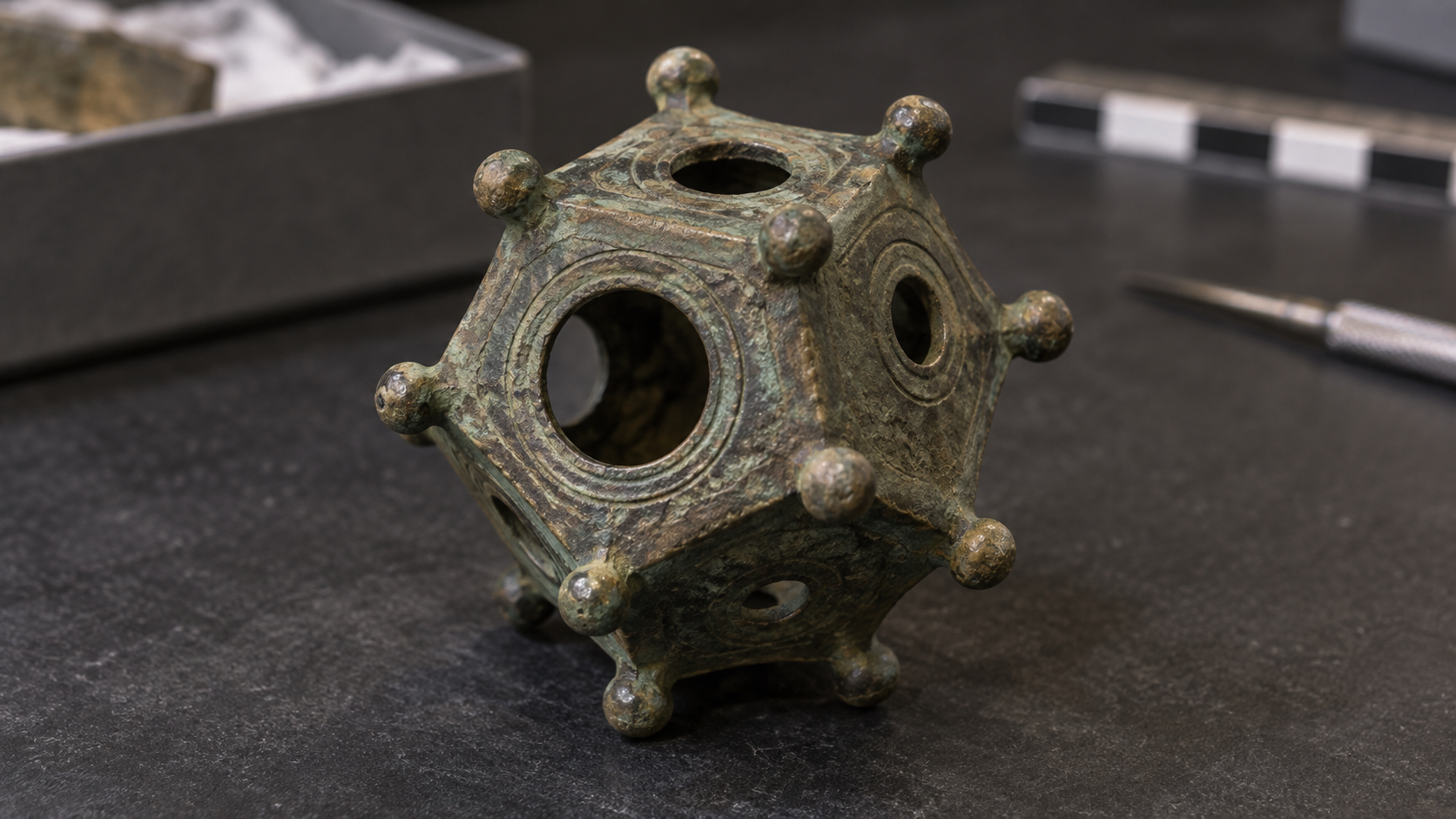
More than a hundred small, twelve-sided bronze objects have survived from the Roman world. They have holes, knobs, careful workmanship—and no agreed purpose.
It is the sort of object that appears to be one missing sentence away from making sense. A Roman dodecahedron is hollow, roughly fist-size and made from copper alloy. It has 12 pentagonal faces, a differently sized hole through each face and a rounded knob at every corner. It looks precise. It looks purposeful. Nobody can say with confidence what it did.
That gap has made the object one of archaeology’s most efficient theory generators. Dodecahedra have been called candlesticks, dice, range finders, surveying tools, knitting devices, calendars, games and religious objects. A replica can often be made to perform one of those jobs. The harder question is whether an ancient person ever asked it to.
About 130 examples and fragments were known across Europe when archaeologist Lorena Hitchens reported on a particularly fine specimen excavated at Norton Disney in England in 2023. A newer catalogue cited by researchers in 2025 lists 134. They have been found in the northern and western provinces of the Roman Empire—especially Britain, Gaul and the Germanias—but not in Italy or around the Mediterranean. The distribution alone is a warning against imagining a universal Roman gadget. These may have belonged to a more regional Gallo-Roman world.
The Norton Disney object makes the mystery tangible. It is 8 centimeters tall, 8.6 centimeters wide and weighs 254 grams. Its pentagonal faces are equal in size, but its openings range from 9.9 to 29 millimeters. Concentric rings decorate the holes. The casting is complete, the workmanship is excellent and all 20 knobs survive. It is not debris that happens to resemble geometry. Someone invested skill and metal in making exactly this strange thing.
Yet the Romans left no manual. No surviving text clearly describes these objects. No inscription identifies one. Researchers have not found an unambiguous depiction in a mosaic, wall painting or sculpture. Even dating them can be difficult because many were discovered long ago, removed from their archaeological context or recorded poorly. Of the 33 British examples Hitchens counted, only four had reliable dating, none earlier than the late third century.
Context is what turns an object from a shape into evidence. A bowl found in a kitchen and a bowl placed in a grave may be physically identical but archaeologically different. The Norton Disney dodecahedron was valuable partly because volunteers excavated it in place, in a pit containing Roman pottery, building material and animal teeth, near the site of a Roman villa. It was only the third or fourth British dodecahedron recovered in situ, according to the report. That is better than an orphaned museum piece, but it still does not amount to instructions.
The practical theories have an immediate appeal. Different-sized holes suggest measuring. Knobs suggest feet or handling. The hollow body suggests that something went through it, sat inside it or was viewed through it. Online demonstrations show people making glove fingers through replica dodecahedra, sighting distant objects through opposite holes or using the form to cast wax. These experiments can establish possibility. They cannot establish history. A coffee mug can hold pencils, but that does not make it a Roman stationery system.
Variation causes further trouble for precision-tool theories. The objects differ in overall size, hole arrangement and decoration. There is no obvious shared scale engraved on them. A measuring instrument can vary, of course, but a theory must explain both the careful geometry and the lack of apparent standardization. It must also explain why the objects cluster in one part of the empire, why some appear in graves or hoards and why Roman writers never bothered to mention them.
A 2025 paper in The Antiquaries Journal argues for a symbolic interpretation. Michael Guggenberger and Stephen Leach connect the form to Platonic and Pythagorean thought, in which the dodecahedron carried associations with the cosmos, and explore possible links with divination in Gaul and Britain. Their case is an argument, not a solved label. The authors themselves note the absence of a contemporary description and say that better archaeological finds are needed.
That distinction matters because mystery invites confidence faster than evidence permits it. The dodecahedron’s shape is so deliberate that it seems to promise a single clever answer. Once someone demonstrates a use, the demonstration feels like a reveal. But ancient objects were not obliged to have one function, and modern ingenuity is not provenance. A thing might be practical and symbolic, specialized and regional, or used differently across time.
There is also a preservation bias built into the puzzle. Bronze survives. Wood, fiber, leather and spoken knowledge often do not. The dodecahedron may have been one durable part of a larger assembly whose missing pieces made its purpose obvious. It may have belonged to a practice learned by watching rather than reading. The artifact reached us; its operating system did not.
This is why the dodecahedron is more than an archaeological riddle. It exposes a flattering assumption we make about ourselves: that if an object looks engineered, its logic should be recoverable by inspection. Usually that works because we share a culture with the maker. We recognize a socket, a button, a gauge. Remove the surrounding habits, materials and vocabulary, and even precision can become opaque.
The Roman dodecahedron has 12 faces and none of them is a label. Its silence is not a failure of archaeology. It is a clean demonstration of what archaeology is up against. The past does not arrive as a complete world. Sometimes it hands us a beautifully made answer after losing the question.

Cut Grass Smells Like Damage Because It Is
The scent of a freshly mown lawn is made by chemicals released within seconds of injury. To us it smells clean and summery. In the living world, it carries news.
The smell of freshly cut grass has excellent public relations. Candle makers bottle it. Real-estate advice treats it as curb appeal. For many people, one breath of it can summon summer faster than a calendar can.
For the grass, however, the occasion is less idyllic. A mower has just swept through at several thousand revolutions per minute and removed the top of every blade. The familiar fragrance is wound chemistry.
Its main ingredients belong to a family called green leaf volatiles, or GLVs. These are mostly six-carbon aldehydes, alcohols and esters with names such as (Z)-3-hexenal, (Z)-3-hexenol and (Z)-3-hexenyl acetate. No one molecule is simply "the smell of grass." The odor is a blend, and that blend changes quickly after a leaf is cut.
The speed is part of the story. Undamaged tissue contains little of these airborne compounds. Rupture a plant cell, though, and enzymes gain access to fatty acids in its membranes. A pathway involving lipoxygenase and hydroperoxide lyase begins converting that material into volatile molecules almost immediately.
In experiments with Arabidopsis, a standard laboratory plant, (Z)-3-hexenal peaked roughly 30 to 45 seconds after wounding. (Z)-3-hexenol peaked after about two and a half minutes, followed by (Z)-3-hexenyl acetate several minutes later. The scent over a damaged leaf is therefore not a fixed perfume but a short chemical sequence: fresh injury becoming processed injury in real time.
Calling it a "cry for help" is irresistible and not quite right. Plants do not have lungs, voices or nervous systems, and a molecule does not need an intended audience to affect whatever encounters it. Researchers use the drier, more useful term "infochemical": a substance that carries information in an ecological interaction.
Some GLVs have direct antimicrobial or antiherbivore effects. They can also alter defense-related gene activity in intact parts of a damaged plant and in nearby plants under experimental conditions. A 2017 meta-analysis found that GLVs may repel or attract herbivores and their enemies, prime plant defenses, and act against some bacteria and fungi. The exact result depends on the plant, the attacker, the compound, the dose and the setting. Nature did not design one universal alarm tone. It produced a chemical vocabulary with a great many eavesdroppers.
Those listeners are not limited to plants and insects. In 2021, researchers studying white storks around freshly mown meadows found that birds approached from downwind, sometimes from many kilometers away. When the team placed cut grass on an uncut field, storks arrived there too. An unmown field sprayed with a synthetic mixture of three characteristic green leaf volatiles also attracted them.
The storks were not coming to console the vegetation. Mowing exposes insects, worms and small vertebrates that are easier to catch in a shortened field. The odor of damaged plants had become a dinner bell for an animal that could exploit the aftermath. The same airborne information meant injury to one organism and opportunity to another.
This is why the scent resists a tidy moral. Emissions from damaged leaves may discourage an attacker, recruit an attacker's enemy, prepare neighboring tissue, feed microbes, guide a bird or simply disperse and react in the atmosphere. Whether a volatile counts as a signal, a cue or a metabolic consequence can depend on which relationship is being examined.
The lawn adds another complication: it survives precisely because grasses are unusually well built for repeated decapitation. In many grasses, growth tissue sits low on the plant rather than only at a vulnerable tip. Grazing animals shaped that architecture long before lawn mowers did. Cutting still causes damage and costs the plant photosynthetic tissue, but a properly maintained grass plant can regrow from below the cut.
Humans have folded the resulting odor into a completely different system of meaning. We associate it with neatness, warm weather, school fields, weekend chores and the visual order of a newly striped lawn. Fragrance companies can sell the smell because our noses receive the chemistry without receiving the plant's circumstances. To us, green leaf volatiles can smell less like destruction than like a job finished.
That gap is the interesting part. A scent is never only a property of the thing emitting it. It is also an event interpreted by the creature detecting it. The mower, grass, fungus, insect, stork and human can occupy the same cloud of molecules and inhabit entirely different stories.
Fresh-cut grass does smell green. It also smells like membranes breaking, enzymes meeting their substrates, defenses shifting and food becoming visible from the air. Summer's cleanest fragrance is not peace. It is a busy piece of chemical news.
Applause Has to Choose Between a Roar and a Rhythm
A crowd can clap loudly or clap together, but it has trouble doing both. The strange rise and collapse of rhythmic applause is a small public experiment in synchronization.
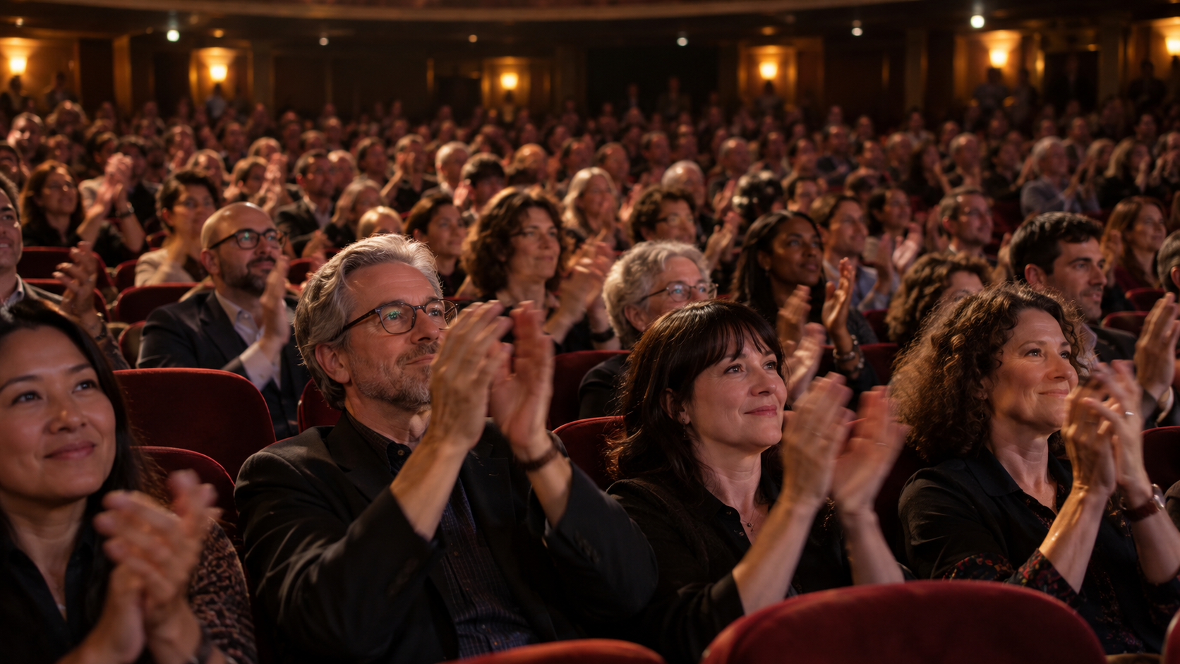
Applause begins as weather. Hundreds of hands strike at slightly different moments, producing a dense, directionless roar. Then, sometimes within seconds, the noise develops a pulse. Strangers who were not given a tempo and cannot see most of one another begin clapping together.
The transformation feels coordinated, but nobody is conducting it. It is a crowd solving a timing problem by ear. More strangely, the solution often destroys itself. The shared beat dissolves back into noise, only to return a little later.
Physicists recorded this cycle in Romanian and Hungarian theaters and concert halls in the late 1990s. In their measurements, published in Nature and Physical Review E in 2000, rhythmic applause emerged when audience members slowed their clapping to roughly half their initial rate. Slowing down did more than create space between claps. It also narrowed the differences among people’s preferred tempos, making it easier for everyone to lock onto the same pulse.
That is the first trick of synchronized applause: the audience does not merely agree on when to clap. Its members shift into a mode in which agreement is possible.
The researchers described each spectator as an oscillator, the same broad mathematical idea used for systems whose parts repeat a cycle. Pendulums, flashing fireflies and pulsing cells can all synchronize when they influence one another strongly enough. In a theater, the coupling travels through sound. Each person hears the collective beat and adjusts. No handshake, countdown or central leader is required.
But applause is not a room full of clocks. The people in it are also trying to express something. This creates a conflict between two perfectly reasonable goals: clap together and make a lot of noise.
Slow, orderly applause has a crisp beat, but its average sound level is lower than that of fast, disorderly clapping. A spectator who wants the response to sound more enthusiastic may speed up. Enough people doing that broadens the range of tempos until the common rhythm can no longer hold. The roar returns. Then the crowd may slow again, reduce the spread of its clapping rates, and find the beat once more.
This is why rhythmic applause can seem to breathe. Order appears, weakens and reappears because the audience is moving between coherence and intensity. In the researchers’ formulation, the system is frustrated: the synchronized state solves the timing problem while making the applause sound less forceful.
The same crowd behavior is also useful before a rhythm ever forms. A 2013 study filmed 107 university students applauding after short academic presentations. The probability that a person would begin clapping rose with the proportion of the audience already clapping. Immediate neighbors did not explain the effect as well as the group-wide acoustic cue did. Applause spread across the room rather than simply passing from seat to adjacent seat.
Stopping was social too. Once some people quit, others became more likely to follow. In that experiment, the average bout lasted just over six seconds, but a model built from the observed start-and-stop decisions produced wide variation even when the supposed quality of the presentation stayed fixed. A long ovation, in other words, can reflect the dynamics of the audience as well as its judgment of what happened onstage.
That does not make applause meaningless. It makes the meaning collective and slightly unruly. The sound is created by individual judgments, physical limits, social cues and chance, all feeding back into one another. Volume is evidence of many hands moving quickly. Rhythm is evidence that those hands are listening. Duration partly records how readily the group can agree to stop.
The familiar wave from chaos to beat also reveals something easy to miss about crowds. Coordination need not begin with consensus, and it does not always end in stability. A temporary order can emerge because each person makes a small correction toward what everyone else seems to be doing. It can vanish for the equally human reason that the orderly response no longer feels emphatic enough.
So the next time applause suddenly snaps into unison, listen to what disappears along with the clutter. The crowd gets a cleaner rhythm by surrendering some of its roar. When the roar comes back, it is not necessarily a failure to keep time. It may be enthusiasm breaking the machine that briefly organized it.

Your Coffee Mug Has a Bare Foot for a Reason
Turn over a ceramic mug and you will usually find a rough, unglazed ring. That small interruption in the finish is what kept the cup from becoming part of the kiln.
Turn over a ceramic coffee mug and the finish usually stops just before the table does. The glossy color gives way to a narrow ring of dull, exposed ceramic. It may be slightly rough. On a handmade cup, it may still carry the faint irregularities of the tool that shaped it.
That bare ring is not where the manufacturer ran out of glaze. It is an escape route.
Glaze looks like paint before firing, but that is not what it becomes. Its ingredients are formulated to melt and form a glassy layer on the ceramic body. The transformation can seal a porous surface, make it easier to clean, add color and texture, and turn a chalky coating into something that appears wet even when it is dry. It also creates a practical problem: molten glaze is sticky.
A glazed cup cannot simply sit flat on a kiln shelf while the glaze matures. If glaze lies between the cup and its support, the two can fuse. When the kiln cools, removing the cup may mean breaking the ware, damaging the shelf, or taking a piece of one along with the other. Kiln wash, a refractory coating applied to shelves, offers some protection from accidental drips. It is not permission to park a glass-coated mug directly on the shelf.
The common solution is called dry-footing. The cup is dipped, sprayed, poured, or otherwise coated with glaze, but the surface that will touch the shelf is left bare. A potter may apply wax resist before glazing so the liquid coating will not adhere there, or wipe the glaze away afterward. Kiln maker Skutt states the rule with unusual bluntness in its firing instructions: any part of the ware touching the shelf cannot have glaze on it.
The foot ring makes that compromise tidy. Instead of withholding glaze from the whole underside, the maker gives the vessel a narrow standing surface. Nearly everything around it can be glazed; only the actual point of contact must remain exposed. During firing, the ring supports the piece. On the table, the same ring becomes its base.
This is why the underside of a mug can seem more revealing than its decorated face. The glossy surface tells you what the maker wanted you to see. The foot tells you how the object stood when heat made the glaze fluid. Porcelain manufacturers inspect foot rings for stability because a small distortion can produce the familiar wobble of a plate or bowl that will not sit quietly. The ring is both a production tool and part of the finished object.
It is not the only solution. Low-fired ceramics can be raised on small pointed supports called stilts or spurs, allowing glaze to cover the bottom. The points leave tiny scars where they touched. Museum catalogues regularly use those marks as clues: a British Museum Dehua porcelain bowl has three spur marks inside, evidence that bowls were stacked during firing to increase the kiln's output. A Korean white porcelain jar in the same collection has glaze scraped from its foot ring and traces of the sand spurs that supported it.
Those marks record a basic economic fact. Space inside a kiln is valuable. Firing consumes fuel, time, equipment life, and labor, so workshops have long developed ways to pack ware closely without letting soft glaze join neighboring objects. In the bottle kilns of the Staffordshire pottery industry, glazed plates were separated inside protective fireclay boxes by pins, saddles, thimbles, and spurs. The furniture of the kiln was an entire hidden architecture built to stop one product from becoming a stack of products.
Different firing methods leave different signatures. Potters working with wood or salt atmospheres may place small lumps of refractory wadding beneath a pot because vapor and ash can create glaze where none was brushed on. Some ware is fired on setters shaped to support it as it softens. Other pieces stand on sand or specialized supports. Fully glazed bases are therefore possible; they simply require another answer to the problem of contact.
Even an unglazed foot needs care. A glaze can run farther than expected. A heavy piece can sometimes stick despite a clean base. At high temperatures, the ceramic body itself approaches vitrification, and a rough or poorly finished ring can become an annoyance on a tabletop. Makers grind, polish, or otherwise finish the contact surface, but they cannot glaze away the original constraint without changing how the piece is fired.
The constraint is old enough to appear ordinary, which is what good manufacturing solutions often become. You do not need to know about silica, refractory shelves, or kiln furniture to set down a cup. The object carries the answer silently: glass everywhere you want it, exposed clay exactly where the furnace demanded it.
The next time a mug leaves a faint circle on a desk, turn it over. The least decorated part is doing the most explanatory work. That modest bare ring is the point where an object designed for the hand once had to negotiate with fire.

There Are Lakes at the Bottom of the Ocean
In a few places on the seafloor, water gathers inside water. These brine pools have shorelines, ripples, and strange communities living at an edge where ordinary seawater becomes something much harsher.
A lake at the bottom of the ocean sounds like a category error. The seafloor is already underwater. What could a lake possibly contain that the ocean does not?
More water, as it happens—but water altered enough to behave like a different liquid. In parts of the Gulf of Mexico and several other marine basins, extremely salty brine settles into depressions on the seabed. It forms pools with visible surfaces, shorelines, and sometimes ripples. Dense brine can also spill downhill in streams or waterfalls that remain distinct from the seawater around them.
The trick is density. Ordinary seawater contains dissolved salt, but brine pools contain much more. The extra salt makes the brine heavier per unit of volume, so it sinks through surrounding seawater and collects in low places. The boundary can be sharp enough for a remotely operated vehicle to hover above what looks uncannily like a pond.
This is not an optical illusion, although the deep sea supplies plenty of theatrical lighting. It is a boundary between two bodies of water with different salinity, density, chemistry, and often oxygen content. A vehicle disturbing the interface can send slow waves across it. Sediment may mark a recognizable bank. The old landscape vocabulary—lake, shore, river—starts working again several hundred meters beneath the waves.
In the northern Gulf, the story begins with buried salt. During the Jurassic Period, an earlier sea repeatedly evaporated and left enormous salt deposits behind. Later sediments covered them. Because salt is relatively buoyant and deforms under pressure, it moved through the layers above in domes and other structures, helping create faults and pathways for fluids.
When water moving through the subsurface encounters that salt, it dissolves some of it. The resulting concentrated brine can migrate upward and emerge at the seafloor as a cold seep. If the terrain provides a basin and the flow does not disperse immediately, a brine pool forms. NOAA explorers have documented them from modest depressions to large features with islands, carbonate outcrops, and flowing channels.
The resemblance to an ordinary lake ends quickly at the waterline. Many deep brine pools are hypersaline and nearly or entirely without oxygen. Some contain methane, hydrogen sulfide, and other reduced chemicals. An animal adapted to normal seawater can be stunned or killed after crossing the interface. The pool may look calm because, chemically, it is a severe place.
This has encouraged a durable nickname for one Gulf site: the “hot tub of despair.” The phrase is memorable and the footage is eerie, but it can flatten the biology into a horror prop. Brine pools are not simply dead zones. Their interiors and margins can support intricate microbial systems, while the sharp chemical gradients around them create opportunities for organisms that do not depend directly on sunlight.
At some pool edges, mussels form dense living borders. A 1990 study described a 540-square-meter mussel bed ringing a brine-filled depression 650 meters deep off Louisiana. The brine was anoxic, very salty, and rich in methane. Bacteria living symbiotically in the mussels used methane as an energy source, allowing the animals to occupy a food web powered by chemistry rather than photosynthesis.
That arrangement requires access to two incompatible worlds. The mussels need oxygenated seawater, but their bacterial partners benefit from methane rising with the seep fluids. Along a suitable boundary, an animal can remain in the seawater while tapping chemical energy arriving from below. The shore is not just scenery. It is the infrastructure of the ecosystem.
Other microbes perform their own transformations of carbon and sulfur in the brine and sediment. Different pools can have very different flow rates, chemical inputs, and microbial communities, so “brine pool” describes a physical form rather than one uniform habitat. Some have conspicuous mussel beds or bacterial mats. Others lack that fringe because the useful chemical boundary is too broad, too deep, or otherwise inaccessible.
The pools also preserve a strange lesson about scale. Salt deposited by an ancient evaporating sea can be buried, squeezed, dissolved, and returned millions of years later as a lake inside another sea. Geology has taken an absence of water—evaporation—and turned it into one of the ocean’s most watery-looking features.
Scientists study these places partly because they stretch the known limits of life. High salinity, low oxygen, darkness, pressure, and unusual chemical energy make brine pools useful natural laboratories. Researchers have also considered them analogues, with necessary caution, for chemically stratified environments that might exist on ocean worlds beyond Earth. The comparison does not mean a Gulf brine pool is a miniature alien ocean. It means both force the same useful question: what combinations of liquid, chemistry, and energy can sustain biology?
They are difficult places to study. Deep-sea work is expensive, observations are brief, and instruments can sample only a small part of a pool without disturbing it. Even in a well-explored basin, the 2026 scientific review of Gulf brine pools concluded that many likely remain undetected and that these environments are still understudied.
That leaves the image itself: a submersible descending through open water until a second surface appears below. The ocean, which seemed like the container, becomes the atmosphere. The seafloor becomes a landscape. And there, bordered by mussels and pale microbial mats, is a body of water behaving as if it has found the bottom of the world and decided to settle.

Casey’s Criteria: The 10 Movies I’ll Defend Forever
A very personal top 10 - ninjas, vampires, cowboys, werewolves, drunken millionaires, and one nearly century-old warning about technology and inequality. These aren’t the “greatest” movies ever made. They’re the ten I’ll defend forever.
Movie lists are usually traps.
Put Citizen Kane too low and somebody gets offended. Leave The Godfather off entirely and somebody starts questioning your judgment. Admit that one of your favorite movies involves ninjas, cheerleaders or Sylvester Stallone firing an explosive arrow and suddenly everyone becomes a film professor.
So this is not a list of the ten “greatest” movies ever made.
These are my ten.
The Casey’s Criteria list.
Some are masterpieces. Some are ridiculous. A few are both. What they have in common is that I can put them on again and again and still find something in them that works.
Starting at number ten:
10. American Ninja (1985)
If you were a little boy in the 1980s, there was a pretty good chance you wanted to be a ninja.
I certainly did.
Plastic throwing stars. Questionable attempts at flips. Karate moves that probably looked considerably better in my head than they did to anyone watching. Ninjas were everywhere, and American Ninja captured that obsession perfectly.
It is an almost pure specimen of 1980s American macho fantasy: one quiet guy, impossible fighting skills, an army of disposable bad guys and absolutely no need to ask whether any of this makes sense.
That is part of the charm.
American Ninja understands exactly what kind of movie it is, and for a kid in the '80s, it was basically a training film for the person you hoped you might someday become.
9. Xtro (1982)
There are polished science-fiction movies, and then there are movies that feel like something crawled out from behind your refrigerator at three in the morning.
Xtro belongs firmly in the second category.
It may be one of the creepiest science-fiction films ever made. There is something deeply wrong about nearly everything happening on screen, and I mean that as a compliment.
The practical effects are bizarre, physical and unsettling in a way CGI often struggles to reproduce. You aren't simply watching something strange. You feel like you shouldn't be watching it at all.
It is cinematic nightmare fuel.
And somehow that makes it gold.
8. The Cheerleaders (1973)
Yes, there is an obvious objection here.
You can reasonably argue that The Cheerleaders isn't terribly far removed from soft-core porn.
Fair enough.
But there is also a playfulness about it that makes the movie better than it really has any right to be. The cast commits to the whole thing with a strange confidence. It's naughty without becoming grim, ridiculous without becoming completely cynical.
And, yes, there are tiny skirts.
But what makes the movie work is attitude. It possesses that loose, slightly dangerous early-1970s energy when movies could feel as though somebody simply gathered a cast, crossed a few boundaries and decided to see what happened.
You probably couldn't make it today.
That is part of the appeal.
7. Rambo: First Blood Part II (1985)
I know.
The first Rambo is the more serious movie.
It has more to say about Vietnam, trauma and the way America treated returning veterans.
But the second one has bigger muscles and bigger explosions.
Sometimes that wins.
Rambo: First Blood Part II takes everything about the character and turns the dial until it breaks off. Stallone becomes less a man than a force of nature. Bullets fly. Things explode. Rambo emerges from mud looking like vengeance itself.
Subtle?
Absolutely not.
Fun?
Absolutely.
6. They Live (1988)
This movie has somehow become more relevant with age.
Advertising controls you. Wealth controls you. Language is manipulated. People obediently accept instructions they don't even realize they're receiving.
And the only way to see reality is by putting on a pair of very cool sunglasses.
John Carpenter wrapped Orwellian paranoia, economic inequality and alien conspiracy inside what looks like a goofy action movie. Underneath it is a remarkably angry film about class and manipulation.
We are all puppets.
In They Live, the people pulling the strings just happen to be aliens.
It also contains what may be the greatest unnecessarily long fistfight ever filmed. Two men beat each other nearly senseless because one of them won't put on the sunglasses.
Cinema.
5. Let the Right One In (2008)
The original Swedish version.
This one is frequently described as a story about a bullied child finding an unlikely protector.
That's true.
But it is much darker than that.
The revenge against the bullies feels satisfying for about five minutes, until you start thinking about what this relationship actually means.
Eli doesn't age.
Oskar will.
And once you understand that, the entire movie changes.
The elderly man helping Eli at the beginning suddenly stops looking like just an old accomplice. You begin wondering whether he was once another Oskar—a lonely little boy who met a mysterious child and thought he had found someone who would stay with him forever.
Perhaps Oskar isn't escaping his miserable childhood.
Perhaps we are watching the beginning of his entire life.
And perhaps, decades later, he will simply be another worn-out old man who has become disposable.
That's what makes the movie frightening.
The vampire isn't the scariest part.
Time is.
4. Arthur (1981)
This one hits close to home.
Arthur is short, rich, irresponsible, constantly drinking and having the time of his life.
Naturally, I relate…at least with being short and having the time of my life.
Dudley Moore somehow makes a character who could have been unbearable completely lovable. Arthur isn't just drunk. He's delighted by practically everything. He floats through the movie laughing at his own jokes, talking to strangers and treating adulthood as a mildly inconvenient rumor.
And underneath all that silliness is a genuinely sweet story about a man who has everything except the freedom to decide what he actually wants.
The movie works because Arthur is such good company.
You don't simply watch him.
You want to spend the evening with him.
3. An American Werewolf in London (1981)
“Jack, you little meatball.”
You simply cannot write a better dead best friend.
Jack keeps returning in progressively worse stages of decomposition while somehow remaining one of the funniest characters in the movie.
But An American Werewolf in London isn't really a horror movie to me.
It's a tragedy disguised as one.
David falls in love. For a brief period, there is the possibility of an entirely different life waiting for him. Then something ancient and violent takes control of his body and destroys it.
That's closer to tragic romance than monster movie.
And the transformation effects?
More than forty years later, I still don't think they have been surpassed.
You can see the body changing. Stretching. Breaking. Becoming something else.
It hurts just watching it.
2. The Good, the Bad and the Ugly (1966)
The title gives you three characters.
The trick is that you have to love all three.
Tuco may be the ultimate survivor. He is greedy, treacherous, funny, desperate and almost impossible to kill. Call him a rat if you want.
Rats survive.
Angel Eyes is terrifying for a completely different reason. He accepts a job, and you know he's going to see it through. There is an awful professionalism about him.
And then there is Blondie—the “Good.”
Except he isn't exactly good.
He's calculating. He cheats. He kills. He drags Tuco through the desert and leaves him hanging when convenient.
Yet he's still the one you root for.
That's what makes the movie so much richer than a simple hero-versus-villain Western. Everybody occupies some shade of moral gray.
And somehow these three men circling one another in search of buried gold becomes enormous—funny, cruel, beautiful and almost mythological.
1. Metropolis (1927)
Nearly a century later, Metropolis still looks like the future.
That alone is astonishing.
But the reason it sits at number one is not simply the imagery.
It is everything underneath it.
The wealthy live above.
The workers live below.
Machines consume human beings. Technology promises progress while reinforcing inequality. Powerful people become fascinated with replacing workers with something more controllable.
And then a human being is literally copied by a machine.
Watch that in the age of artificial intelligence.
Suddenly a silent movie from 1927 doesn't feel quite so old.
The symbolism can be almost absurdly heavy, but I love that about it. Metropolis isn't interested in whispering its ideas. It builds skyscrapers around them.
Class. Labor. Technology. Power. Automation. Inequality. The fear that the people controlling the machines may understand their value better than they understand the people operating them.
We are still arguing about all of it.
And then there's Maria.
Yes, Maria is hot.
Some critical standards are timeless.
That is Casey's Criteria.
Ten movies separated by ninjas, vampires, aliens, werewolves, cowboys, cheerleaders, drunken millionaires and approximately 98 years of filmmaking.
I wouldn't argue that they're the ten greatest movies ever made.
I would argue something much more important:
They're the ten I want to watch again.
The Moon Is Still Wrinkling
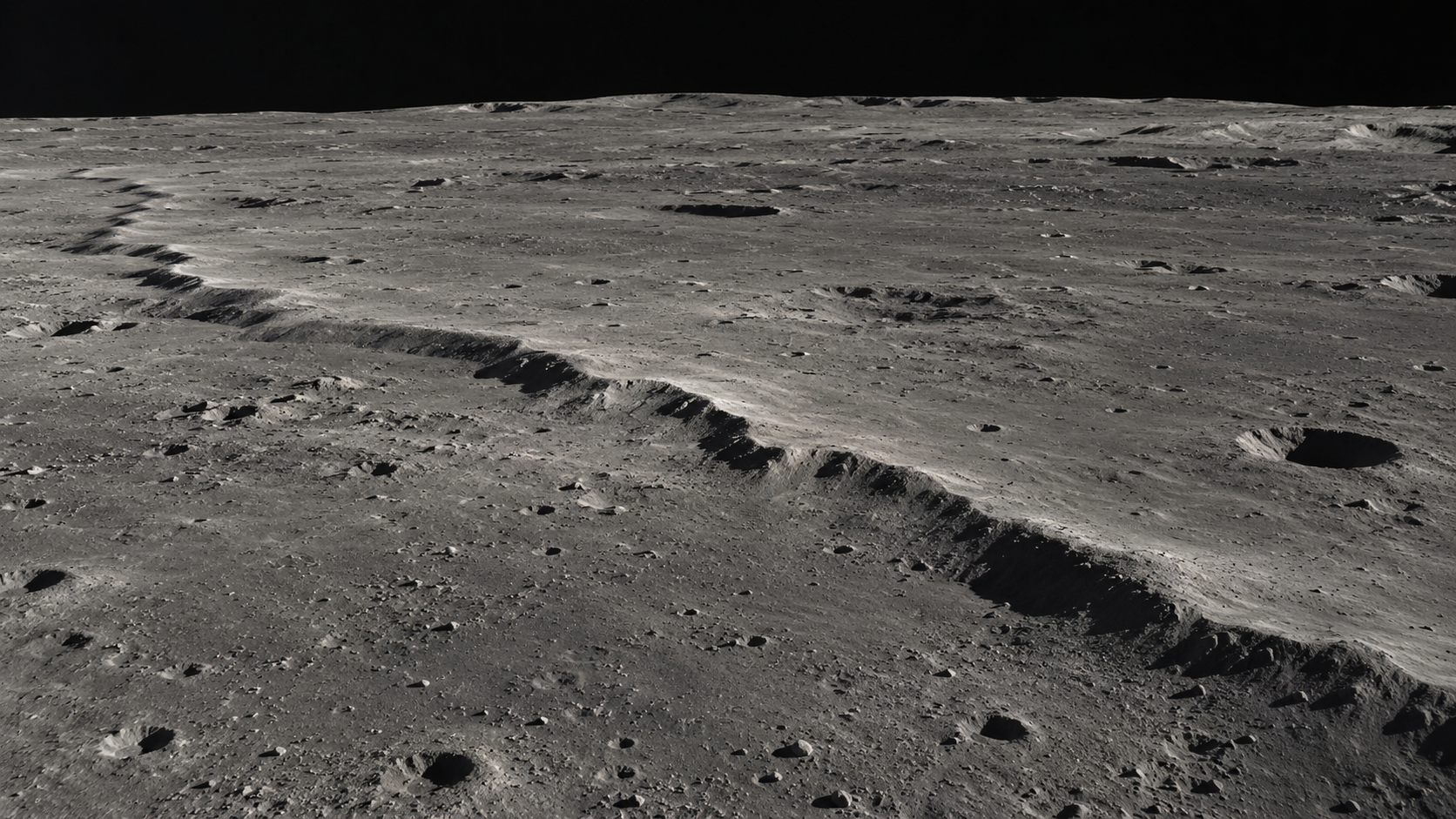
The Moon has no moving tectonic plates, but it is not geologically finished. As its interior slowly cools and contracts, the crust buckles into small cliffs—and some of those faults may still produce moonquakes.
The Moon presents a convincing impression of completion. Its great dark plains hardened billions of years ago. Its most obvious features are impact scars. With no wind, rain, rivers, or moving tectonic plates to remake the scenery, the lunar surface can seem less like a landscape than a record placed under glass.
But the Moon is not finished. It is still losing heat, still contracting, and still gathering new wrinkles.
Those wrinkles are called lobate scarps: low, curving cliffs that can run for kilometers across the surface. They form where the crust is compressed and one block of rock is pushed up over another along a thrust fault. Seen from orbit in low sunlight, a scarp casts a narrow shadow like a welt across the ground. On the surface, it would look more like a steep step or rounded ridge than a canyon.
The basic mechanism begins deep below. The Moon formed hot, and its interior has been cooling ever since. Cooling material generally contracts. As the volume inside decreases, the rigid outer crust must accommodate a slightly smaller world. It cannot shrink smoothly like a balloon losing air. It breaks, overlaps, and buckles.
The change is modest on a planetary scale. Research based on the accumulated shortening across lunar scarps has estimated a decrease of roughly 100 meters in the Moon’s radius over hundreds of millions of years. Set against a radius of about 1,737 kilometers, that is almost nothing. Geology, however, is very good at turning almost nothing into a cliff.
Apollo astronauts gave scientists the first close views of some scarps, but the Lunar Reconnaissance Orbiter transformed the census after it began mapping the Moon in 2009. High-resolution images revealed a global population of thousands of these landforms. Their distribution is one reason researchers connect them to contraction of the whole Moon rather than to isolated local events.
Their appearance also suggests surprising youth. Small impact craters crosscut by faults, crisp topography, and displaced rocks indicate that some scarps formed within the geologically recent past. “Recent” has a generous meaning in planetary science: many are thought to be younger than a billion years, and evidence at some sites points to activity within the last tens of millions of years. That is young enough to complicate the picture of a world that went quiet near the beginning of solar-system history.
Then there are the moonquakes. Seismometers deployed during the Apollo missions operated as a network from 1969 to 1977. They detected several kinds of seismic events, including vibrations from impacts, deep moonquakes associated with Earth’s tidal pull, and 28 shallow moonquakes. The shallow events were comparatively strong and remain the most relevant to the young faults near the surface.
Connecting old seismic recordings to particular faults is difficult. Four stations on the near side of the Moon make a sparse network, and the estimated epicenters have large uncertainties. A 2019 reanalysis relocated the shallow events and found eight estimated epicenters within 30 kilometers of a young fault scarp, a distance consistent with strong shaking. The timing of several events also matched periods of high compressional tidal stress. Together with signs of recent rockfalls and disturbed soil near scarps, the pattern supports an active Moon—but it does not turn every visible scarp into a confirmed earthquake source.
Earth contributes to the stress. Its gravity continually deforms the Moon by a small amount as the distance between the two bodies changes during the lunar orbit. These tidal forces do not explain the global contraction, but they can add to the pressure already stored in the crust. A fault close to slipping may receive a final nudge from the monthly rhythm of the orbit.
A moonquake is not simply an earthquake in gray surroundings. Earth’s fractured, fluid-altered crust tends to damp seismic energy. The Moon is colder, drier, and more rigid, with intensely broken near-surface material created by impacts. Seismic waves can scatter and reverberate there for much longer. Apollo instruments recorded some signals fading only gradually, which is the sober science behind the theatrical claim that the Moon “rang like a bell.” It did not sound through the vacuum; instruments measured prolonged vibrations in rock.
That persistence matters if people intend to place long-lived equipment, landing pads, habitats, or tall structures on the surface. A 2024 study modeled a shallow quake in the south polar region and found that strong ground motion and quake-triggered landslides are plausible near some candidate exploration areas. The practical lesson is not that the lunar south pole is about to split open. It is that site selection and engineering should treat seismic hazards as real local variables, not as impossibilities on a supposedly dead world.
The uncertainties remain large because the Moon’s seismic record is both precious and geographically narrow. Apollo’s instruments stopped transmitting in 1977, and scientists have been extracting new information from that limited archive ever since. A broader, longer-lived network would locate events more precisely, distinguish fault activity from other sources, and reveal how often meaningful shaking occurs.
For now, the scarps supply a visible clue. They are not towering mountain chains or dramatic rifts. They are small accommodations to an almost imperceptible change: an old world cooling by degrees, its circumference tightening, one fault slipping past another.
The Moon still deserves its reputation for preserving the past. Footprints, craters, lava plains, and ancient debris can remain recognizable for immense spans of time. Yet preservation is not the same as stasis. Even under glass, the exhibit is settling.

Old Hollywood Never Had Just One Accent
The famous old-movie voice was real, but it was not one universal accent invented by a studio. It was a shifting mixture of class, region, theater training, performance, and fashion.
You can hear an old movie before you see it. The voices arrive polished and quick, the consonants clipped, the vowels oddly upholstered. An American actor may seem to have one shoe in Manhattan and the other in Mayfair. Nobody at the gas station talks like this anymore.

A Train Wheel Is Not Quite a Wheel
A railway wheel does not steer like a car tire, and its flange is not meant to do all the work. The useful trick is hidden in the changing diameter of its tread.
A train wheel looks as if it has one obvious job: stay between the rails. The flange on its inner edge seems to explain everything. Put a lip on the wheel, trap the track beneath it, and the train can only go where the rails go.
That explanation is satisfyingly wrong.
In ordinary running, railway engineers would rather not have the flange scraping along the rail. Constant flange contact would mean friction, noise, wear, and wasted energy. The subtler steering mechanism is in the tread, the surface rolling on top of the rail. It is not perfectly cylindrical. It is tapered or, on modern wheels, shaped into a carefully designed profile that behaves something like a shallow cone.
The distinction matters because the two wheels on a conventional wheelset are rigidly fixed to the same axle. They turn together at the same rate. That is wonderfully simple on straight track, but it creates a puzzle in a curve: the outside rail traces a longer path than the inside rail, much as the outside lane of a running track is longer than the inside lane. How can two locked wheels cover different distances without one of them sliding?
They can do it by becoming, in effect, two different-size wheels.
As a wheelset shifts sideways in a curve, the outside wheel meets its rail on a larger rolling radius while the inside wheel meets its rail on a smaller one. Both wheels still complete each rotation together, but the larger effective circle travels farther per turn. The axle does not need a differential like a car. A small lateral movement across the profiled treads supplies the difference.
This geometry also helps on straight track. If the wheelset wanders to one side, the two contact points move onto unequal rolling radii. Because the wheels remain locked together, that difference encourages the wheelset to yaw back toward the center. The wheel and rail are not merely a wheel and a groove. They form a passive guidance system.
The flange is still essential. It provides a limit when tread geometry alone cannot keep the wheelset where it belongs, including in tight curves, switches, rough track, or abnormal movement. Flange contact can be heard in the squeal of a difficult curve and seen in wear on wheels and rails. It is a boundary condition with a conspicuous voice, which may be why it gets credit for the quieter work done above it.
The popular demonstration uses two dramatic cones joined at their narrow ends and rolled along a pair of rails. It is a lovely piece of tabletop physics, but a real wheel profile is less tidy. Actual treads may include several slopes and curves, and the railhead is curved too. Engineers therefore use a measure called equivalent conicity to describe how the combined wheel-and-rail shapes produce changes in rolling radius as the wheelset moves sideways.
That word combined is important. Conicity is not simply a property machined into a wheel forever. The result depends on the wheel profile, rail profile, track gauge, rail inclination, and wear. A newly turned wheel on one rail shape may behave differently after thousands of miles on another. The steering mechanism is an agreement between two surfaces, and both surfaces slowly rewrite it.
More self-steering is not automatically better. The same geometry that nudges a wandering wheelset back toward center can set up a side-to-side motion. In the idealized nineteenth-century model associated with Johannes Klingel, a free conical wheelset follows a repeating wave along straight track. Real vehicles add suspension, mass, friction, flexible components, imperfect track, and nonconical profiles, making the motion far more complicated. At sufficient speed, poorly controlled lateral motion can become the instability railway engineers call hunting.
This creates one of rail engineering's characteristic bargains. Greater effective conicity can improve guidance and curving, but it can also lower the speed at which unstable motion becomes a concern. Lower conicity favors high-speed stability but may weaken the wheelset's natural steering. Vehicle suspension, wheel profile, rail shape, maintenance limits, route geometry, and operating speed all have to negotiate the compromise.
The compromise is monitored in metal. Wheels are measured and periodically reprofiled because wear can alter their relationship with the rail. Rails are ground for related reasons, including controlling damage and restoring useful contact geometry. European railway specifications set equivalent-conicity limits for combinations of wheel profiles, rail profiles, gauge, and speed. The numbers are not ornamental tolerances. They describe how a vehicle and its track will behave together.
This is also why a train wheel is difficult to understand in isolation. On a workshop floor it appears to be an extremely sturdy disc with an oversized rim. On the railway, it is one half of a matched wheelset, one surface in a rolling contact pair, and one moving part in a suspension system. Its exact working diameter changes from moment to moment depending on where it touches the rail.
The train does not follow the track because a metal lip spends the whole journey dragging along the side. Most of the time, guidance emerges from two shaped surfaces meeting at slightly different radii, correcting and compromising at speed. The flange waits nearby for the geometry's limits.
A railway wheel is therefore less like a cart wheel captured in a slot and more like a mechanical argument that continuously solves itself. The rails provide the route. The profile makes that route negotiable. And a few millimeters of sideways motion let two wheels locked to one axle travel different distances without ever disagreeing about how fast to turn.
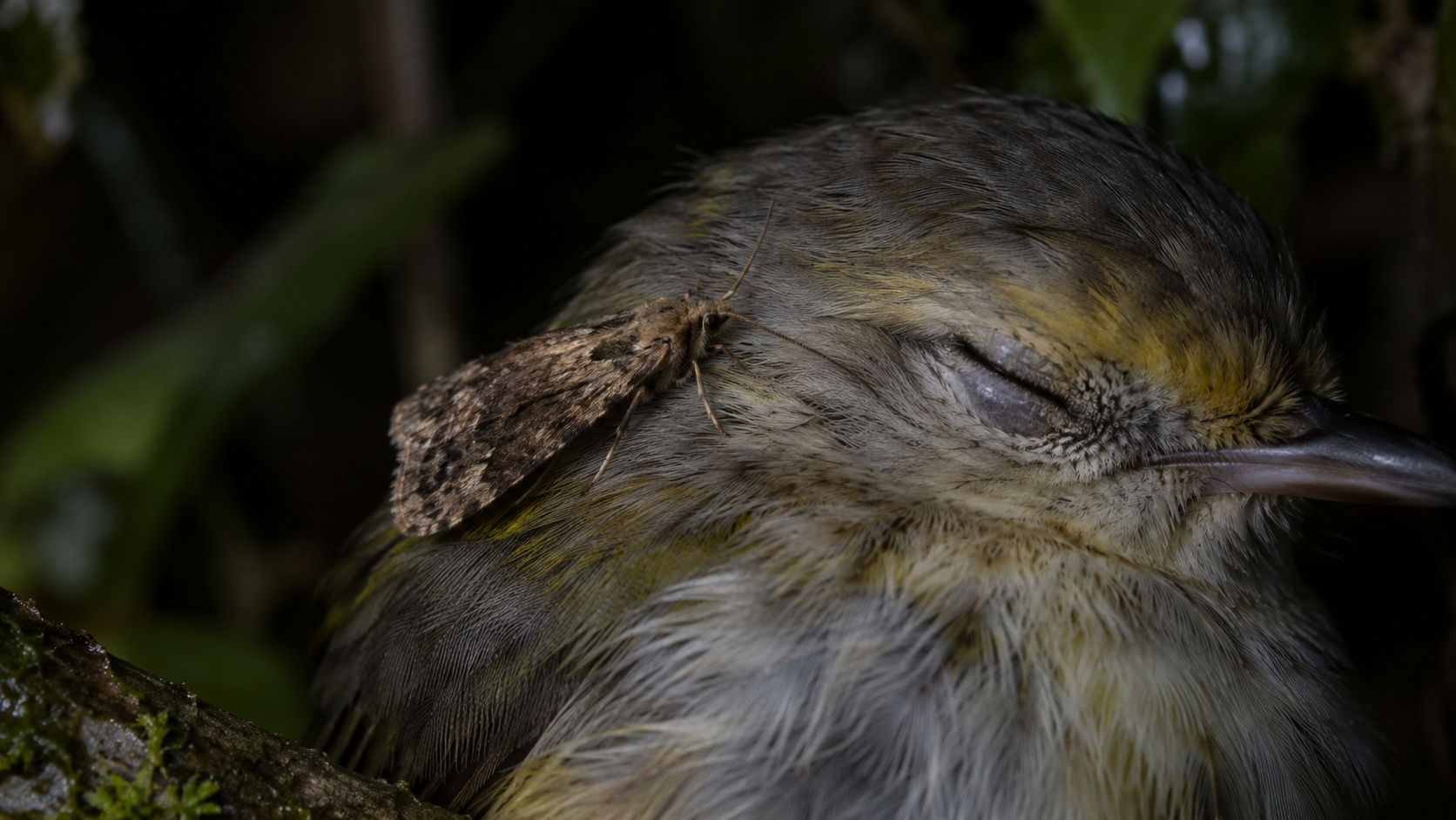
Some Moths Come to Drink Tears
For a few moths, an eye is not merely something that sees them coming. It is a small, replenishing source of salt, water and protein.
A moth lands on the neck of a sleeping bird. It walks toward the head, uncoils a narrow proboscis and slips the tip beneath a closed eyelid. Then it drinks.
This is not a miniature horror invented for a nature documentary. It is lachryphagy: feeding on tears. A scattered assortment of moths has been observed taking eye secretions from animals including cattle, horses, deer, elephants, crocodilians and, in a particularly intimate variation, sleeping birds.
The behavior sounds extravagantly strange until tears are treated as chemistry rather than emotion. Adult moths live mostly on liquids, but sugary flower nectar and fruit juice do not provide everything an insect needs. Tears offer water, salts and small amounts of protein. Sodium is especially valuable to plant-eating animals because plants generally contain relatively little of it.
This is the same nutritional problem behind the more familiar sight of butterflies gathering on mud, dung or sweaty skin. Biologists call that behavior puddling. A tear-drinking moth has found a livelier mineral spring, one that blinks.
There is no single tear-drinking branch of the moth family tree. A 2013 review of moths and butterflies that consume blood, sweat and tears found the habits distributed among several lineages. The equipment varies with the method. Some species sip fluid already exposed around an eye; others use a probing proboscis whose ridges, hooks or movements may irritate the tissue and encourage more tears.
That distinction matters. A drinking straw is passive. A tear-feeding proboscis can be both straw and tiny rake. A major review of butterfly and moth mouthparts notes that the probing movements of some species increase tear flow and can cause pain when the host is human. The meal may manufacture a little more of itself.
The most startling specialists belong to the African genus Hemiceratoides. In western Madagascar, researchers observed H. hieroglyphica visiting two species of sleeping birds. The moth sat on the bird's neck and reached forward, inserting a sharply tipped, armored proboscis between the protective membranes of the closed eye. The original report, published in 2007, was the first scientific description of a moth exploiting tears from the closed eyes of sleeping birds.
The birds did not always remain serene. They shook their heads, scratched and tried to dislodge the insects. Yet the moths returned, sometimes staying at an eye for more than half an hour. The researchers argued that this was not a thirsty insect making an accidental stop: the visits were repeated, directed and supported by specialized anatomy.
For years, the behavior looked like one of Madagascar's evolutionary peculiarities. The island has no native elephants or hoofed mammals, the large and relatively tolerant hosts commonly visited by eye-frequenting moths elsewhere. Perhaps, researchers proposed, local moths had turned to birds because the usual mammalian faces were missing.
Then a sleeping bird in Tanzania complicated the story. Video showed another Hemiceratoides moth bothering a common whitethroat on the African mainland, where large mammals are hardly absent. A 2024 taxonomic study used that footage, museum specimens, anatomy and DNA to revise the genus and describe two new species. The authors concluded that bird tear-drinking may be a basic feature of the group rather than an island workaround.
The specialization is written into the moth's face. Hemiceratoides species have unusual modifications at the tip of the proboscis. In at least one species, males also carry long, fang-like mouthpart structures that researchers suspect help with feeding. What the fangs actually do, and whether females drink tears too, remain open questions.
So does the precise value of the meal. Salts are an obvious prize, but tears contain more than salt water. Earlier work found white blood cells being digested in the guts of some eye-frequenting moths, suggesting that protein can matter as well. The 2024 researchers asked whether the barbs of Hemiceratoides might irritate the conjunctiva to release more fluid. They did not claim to know.
That restraint is useful because spectacular animal behavior attracts tidy explanations faster than evidence. Even the word "tear" encourages a sentimental mistake. The moth is not drinking sadness. It is exploiting a physiological fluid, and the host is not volunteering it. Scientists have raised the possibility that eye-visiting moths could move microbes between animals, but the disease risk remains much less settled than the feeding itself.
Nor is every moth near an eye necessarily drinking. Researchers distinguish true lachryphagy from the broader habit of frequenting eyes. Proof can require close observation, specimens and mouthparts adapted to the task. A single eerie photograph may capture contact without revealing what, if anything, entered the insect.
Still, the confirmed cases are intimate enough. An eye must stay wet to work, which means the body continually maintains a thin exposed resource at its surface. Most creatures experience that film as protection. A tear-drinking moth experiences it as habitat: a saline margin where one animal's maintenance becomes another animal's meal.

Hold Music Is Trying to Prove You Have Not Been Abandoned
Hold music is not really there to entertain you. It fills a dangerous silence, squeezing reassurance through a telephone system built first for speech.
Hold music has an impossible job. It must reassure you without making promises, occupy you without demanding attention, and sound acceptable through a channel that can turn a piano into cutlery falling down a stairwell.
That thin loop between customer-service announcements is easy to treat as sonic wallpaper. But hold music is better understood as a status light for the ear. Its first message is not the melody. It is: the line is still alive.
Before music filled the gap, a caller placed on hold could hear what sounded like a dead connection. In 1962, New York inventor Alfred Levy filed a patent for a "telephone hold program system." The patent, granted in 1966, described the silence of a held line as tedious and potentially confusing. A caller might think the connection had broken, hang up, and try again.
Levy's proposed fix was to connect the held caller to "program material" such as music. The patent envisioned phonographs, tape recorders, radio, live programming, and commercial music lines. The aim was strikingly candid: occupy the caller, reassure them that the call had not been forgotten, and make idle time easier to bear.
A charming origin story says Levy got the idea after a loose wire at his factory touched a steel girder and accidentally picked up a nearby radio station. The story has been repeated for decades, but the recent Smithsonian history of hold music sensibly treats the accident as folklore rather than established fact. The patent is firmer ground. It records the moment silence became a customer-retention problem with a soundtrack.
The strange sound of hold music begins with another design decision: the telephone network was built to carry intelligible speech, not a faithful concert. Conventional narrowband telephony uses roughly the 300-to-3,400-hertz range. That is enough information for people to understand one another, but it cuts away low bass and much of the upper brightness that gives music space, shimmer, and definition.
Wideband telephony can extend that range to about 100 to 8,000 hertz, and modern internet-based systems can sound much better. Yet a call may still pass through equipment, codecs, or configurations designed around older telephone expectations. Cisco's own music-on-hold documentation, for example, requires administrators to manage audio sources and supported codecs. The music is not simply played. It is prepared, encoded, routed, and sometimes converted on its way to one waiting ear.
That process is especially unkind to dense recordings. Cymbals, reverberation, layered instruments, and deep bass depend on frequencies or detail that a narrow speech channel may discard. Loudness processing and repeated encoding can make the result harsher. A simple arrangement with a clear melody tends to survive because there is less for the channel to turn into fizz. Hold music often sounds generic partly because generic can be durable.
The interruptions matter too. A recording may be repeatedly ducked or stopped for reminders that an agent will answer soon, that the call may be recorded, or that the website exists. Those messages provide useful evidence that the system is functioning, but they also reset the musical phrase. A three-minute track becomes a collection of fragments. Time stops feeling like a song and starts feeling like a corridor with the same door every twenty seconds.
Researchers have spent surprising effort studying that corridor. A 1997 study of telephone waits found that silence, music, and a choice of listening options changed perceived waiting and attitudes toward the company. Later research with bank customers found that music or wait-time updates generally produced better satisfaction than a ringing tone and could reduce overestimation of the wait, although the length of the actual delay remained crucial. Other experiments suggest that liking the music matters, which will not shock anyone who has spent twelve minutes trapped with a synthetic saxophone.
The evidence does not support a magic playlist that makes long waits disappear. Studies vary by setting and design, and music can influence emotion and time estimates in different ways. The more durable lesson is simpler: an unexplained wait feels different from a wait that supplies signs of life. Sound gives the caller something against which to measure uncertainty.
This is why the most humane hold systems increasingly behave less like radio stations and more like instruments. They offer callbacks, give a place in the queue, estimate the delay, or explain what will happen next. Music may soften dead air, but information can return a small amount of control. The caller can decide whether to keep listening, switch tasks, or leave without surrendering a place in line.
Hold music survives because silence on a telephone is ambiguous. In a room, silence can be peaceful. On a service call, it can mean patience, disconnection, neglect, a muted agent, a broken transfer, or a system quietly wasting your afternoon. The melody exists to narrow those possibilities.
So the next time a four-bar keyboard loop arrives through the speaker in all its brittle glory, listen past the tune. You are hearing an old interface perform reassurance. The music is not really asking to be enjoyed. It is blinking in the dark.

An Old Book Is Slowly Making Its Own Perfume
The smell of an old book is not one scent but a chemical biography: vanilla, almond, grass, sourness, dust, and the quiet evidence of paper breaking down.
Open an old book and the first thing you read may not be a sentence. It may be the air between the pages: woody, sweet, dusty, faintly sour, perhaps a little like vanilla or almonds. The book has acquired an atmosphere.
That smell is often treated as a romance supplied by age, as though time itself had a fragrance. The chemistry is less mystical and more interesting. An old book is slowly releasing volatile organic compounds from paper, ink, adhesives, cloth, leather, and whatever else has shared its shelf. What reaches the nose is not one definitive old-book molecule. It is a mixture, and the mixture is a record of materials coming apart.
Paper is mostly cellulose, long chains built from glucose molecules in plant cell walls. As paper ages, heat, moisture, light, oxygen, acids, and pollutants help break those chains and other components down. Some of the products are small enough to escape into the surrounding air. These are the book's chemical exhalations.
They can smell unexpectedly appetizing. Researchers analyzing historic paper have identified furfural, associated with sweet, bready, and almond-like notes; benzaldehyde, which can suggest almonds or burnt sugar; acetic acid, which smells sour; and hexanal, described as grassy or fatty. Vanillin can emerge from the degradation of lignin, a structural component of wood. The old-book bouquet overlaps with coffee and chocolate because those materials share several volatile compounds with aging paper.
This does not mean every old book smells alike. A cheap twentieth-century paperback, a rag-paper volume from the eighteenth century, and a leather-bound ledger have different starting materials and different histories. Storage matters too. A book kept cool and dry ages differently from one that has spent decades in a damp basement, a smoky room, or direct sun. Dust, furniture, floor wax, mold, tobacco, cooking, and neighboring books all contribute to what a library smells like.
The history of papermaking is especially important. Before the mid-nineteenth century, Western paper was commonly made from cotton and linen rags, whose long fibers could remain strong for centuries under good conditions. As demand grew, manufacturers increasingly turned to wood pulp. Mechanical pulping left short fibers and lignin in the sheet; alum-rosin sizing also made much older wood-pulp paper acidic. Acids, aided by moisture, cut cellulose chains into shorter lengths. The reaction produces more acids as it proceeds, an elegant little disaster that helps paper become yellow, brittle, and weak.
This is why a book from 1700 may be in better physical condition than a newspaper from 1970. Age is not a single setting. Composition and storage can matter as much as the calendar. Since the 1980s, alkaline buffering has become common in papers intended to last, helping neutralize acids before they attack the cellulose.
For conservation scientists, the aroma is more than atmosphere. In a 2009 study, researchers used headspace analysis to examine volatile degradation products from historic paper and correlated them with properties such as lignin content, rosin, acidity, and the condition of cellulose. The premise was appealingly gentle: instead of cutting a sample from a valuable object, study what the object is already giving off.
Later researchers at University College London combined chemical sampling with sensory descriptions to build a historic-book odour wheel. In one museum exercise, visitors most often reached for chocolate and coffee when describing an unidentified historic-book extract. In a small evaluation inside the library at St Paul's Cathedral, every assessor selected "woody"; smoky, earthy, and vanilla also appeared prominently. Gas chromatography and mass spectrometry supplied the compounds. Human noses supplied the language.
The result was not merely a novelty chart for bibliophiles. A volatile profile can offer clues about what a paper contains and how it is deteriorating. The smell readers love may therefore be useful to the people trying to keep the source from disappearing. A book can, in a limited sense, report on its own condition through the air.
There is a caution hidden in that lovely idea. Mustiness is not the same as the normal aroma of aging paper. A strong damp or moldy odor may indicate a moisture problem and possible fungal growth, not an especially authentic library experience. Preservation guidance emphasizes cool, relatively dry, stable conditions, limited light, and appropriate enclosures. Trapping acidic degradation products in a tightly closed environment can also accelerate aging. The right response to a suspiciously wet-smelling book is not a deeper ceremonial sniff.
Smell is unusually good at collapsing time. A few molecules can summon a school library, a grandparent's shelf, or a secondhand shop before the conscious mind has inventoried the room. That emotional force can make the scent seem like proof of permanence: this is what old things smell like because they have survived.
Chemically, it says almost the opposite. The odor exists because the object is changing. Molecules that once belonged to the page are now in the air. The sweetness is evidence of loss, though on a scale slow enough to feel like continuity.
Perhaps that is why old books smell so convincingly of the past. The scent is neither a decorative aura nor time bottled intact. It is material history in motion: paper, glue, cloth, leather, dust, and rooms exchanging tiny pieces with the present. An old book does not merely carry its years. Quietly, continuously, it releases them.