
The Statues Were Never Just White
The bare marble of Greek and Roman sculpture is real, but it is not the whole original. Ancient statues often wore paint, gilding, inlay, and details that time—and later taste—removed.
Walk into a gallery of Greek and Roman sculpture and the ancient world appears to have agreed on a dress code: white marble, pale light, no unnecessary color. Gods, athletes, emperors, and monsters all share the same stony complexion.
It is a persuasive illusion. Many of those sculptures were once painted. Some carried bright garments, patterned borders, colored hair, distinct eyes, jewelry, gilding, or metal attachments. Some were painted more selectively than others, and their exact appearance is often uncertain. But the familiar whiteness is not simply the aesthetic the makers intended. It is also what survived.
The useful word is polychromy, meaning the use of multiple colors. In Greek and Roman sculpture, color was not necessarily a decorative afterthought laid over a finished work. It could supply information the carving did not: the pattern of a textile, the iris of an eye, the edge of a sandal, the distinction between skin and hair, or the shimmer of an ornament. Color helped make a figure legible and present.
The evidence comes in several forms. Ancient texts discuss pigments and painted sculpture. Wall paintings and pottery depict colored statues. Most directly, conservators find pigment on the objects themselves—sometimes visible to the eye, sometimes surviving only as particles or chemical traces.
Egyptian blue is especially obliging. One of the earliest synthetic pigments, it can absorb visible light and emit infrared radiation. A modified camera using visible-induced infrared luminescence can therefore reveal traces that look faint or invisible under ordinary gallery lighting. On sculptures from the Parthenon, researchers have detected Egyptian blue and evidence of elaborate designs on carved clothing.
Other tools contribute different clues. X-ray fluorescence can identify elements associated with pigments. Ultraviolet and infrared imaging, microscopy, and material analysis can map remnants across a surface. Raking light may reveal patterns of weathering where paint once protected the stone unevenly. The investigation is less like removing a curtain than assembling a case from dust.
That last distinction matters because a color reconstruction is not a photograph sent forward from antiquity. Pigments fade, binders disappear, surfaces weather, objects are buried, and records are incomplete. A scan may establish that Egyptian blue was present without telling researchers every shade, layer, or visual relationship in the finished work. Reconstructions range from strongly evidenced details to informed hypotheses, and responsible museums say so.
Ancient sculpture was not uniform, either. The Metropolitan Museum of Art notes that some Roman marble works may have been fully painted and gilded, while others used color selectively on features such as eyes, lips, hair, or attributes. White marble itself was valued for its translucency and fine carving qualities. The correction to an all-white ancient world should not become an equally simple story in which every inch of every statue blazed with the same palette.
So how did bare marble become the default picture of classical beauty? Time did much of the work. Paint is generally more vulnerable than stone. Burial and exposure diminished ancient surfaces. The sculptures unearthed and collected in later centuries often arrived with much of their color already gone.
Later hands finished the job in both material and imagination. Historic cleaning and restoration sometimes removed surviving pigment. Renaissance artists encountered ancient statues largely stripped of color and built new sculptural traditions around what they saw. Neoclassical taste later elevated monochrome form into an ideal, treating whiteness not as a damaged condition but as evidence of restraint, purity, and elevated art.
The misunderstanding became self-reinforcing. Museums displayed pale originals and white plaster casts. Art students copied them. Public buildings borrowed their visual authority. Film sets, textbooks, memorials, and civic architecture taught generations to recognize the ancient world by its lack of color. The ruin became a style guide.
Recovering polychromy does more than add a surprising fact to a museum label. It changes how the sculpture works. A carved fold may turn into a patterned garment. A blank face acquires direction when the eyes return. A mythological creature becomes stranger; an official portrait becomes more immediate. Surface and form, separated by modern taste, begin speaking to each other again.
It also exposes a habit that extends beyond antiquity: confusing survival with intention. We often meet old things after weather, chemistry, excavation, restoration, and fashion have edited them. Then we call the remainder authentic because it is the part we can still see.
The white marble is authentic, of course. It was quarried, selected, and carved by ancient hands. But its present bareness has a history too. What looks like timeless simplicity is partly the accumulated result of fragile paint, durable stone, aggressive cleaning, and centuries of admiration for the wrong final draft.
The next time a marble figure seems serenely colorless, look at it as a conservator might: not as a blank object, but as a surface holding clues. The statue has not been waiting unchanged for us. It has been losing its clothes.

A Chocolate Bar Is a Carefully Arranged Crystal
Before chocolate melts, it makes a promise. Break a well-made bar and it answers with a clean, dry snap. The sound is brief, but it reports on hours of grinding and mixing, a carefully managed temperature history, and a structure too small to see.
Chocolate is not simply a sweet solid. At the microscopic level, it is a crowded suspension of sugar and cocoa particles held inside a continuous fat phase. In dark chocolate, that fat is chiefly cocoa butter; milk chocolate adds milk fat and other complications. When the liquid fat solidifies, its molecules can pack together in several different arrangements. The finished bar depends on which arrangement wins.
Materials scientists call this polymorphism: one substance forming more than one crystal structure. Cocoa butter is commonly described as having six crystal forms, numbered I through VI, though researchers still debate parts of that classification. They do not behave alike. The lower forms are relatively unstable and melt at lower temperatures. Form VI is more stable but is associated with an aged, bloomed bar. Chocolate makers usually aim for Form V, a structure that provides a useful combination of gloss, contraction, melting behavior, and brittle fracture.
That last property is the snap. A bar that bends or smears instead of breaking crisply has failed a small materials test in your hands. The chocolate's stiffness, internal defects, recipe, thickness, temperature, and the speed at which it is broken all matter. In mechanical experiments, chocolate's fracture stress rises as the loading rate increases. The bar is not merely making a sound; a crack is moving through an engineered composite.
The process used to encourage the desired structure is tempering. The name can sound like pastry mysticism, especially when it arrives as a sequence of fussy temperatures. In physical terms, it is controlled melting, cooling, movement, and reheating. The maker first melts away the existing crystal history. Cooling then allows crystals to begin forming. A careful rise to the working temperature melts less desirable, lower-melting structures while preserving enough useful crystal seeds to organize the rest of the cocoa butter as the chocolate sets.
There are several practical ways to do this. A chocolatier may spread molten chocolate across a stone surface, stir in already tempered chocolate as seed, or use crystallized cocoa-butter powder. The method changes; the aim does not. Time, temperature, and agitation are being used to steer molecules toward a fat-crystal network that will release from a mold, shine under a display light, remain solid in the hand, and melt readily in the mouth.
The familiar explanation ends there: Form V makes good chocolate. Recent work adds an important correction. Researchers have found that identifying Form V alone does not guarantee that a sample is properly tempered. Tempered and untempered chocolates can show the same broad crystal form under X-ray diffraction yet differ in bending stiffness and fracture behavior. Crystal size, lattice strain, and defects in the fat network also help determine whether the bar gives a clean snap or a disappointing bend.
This makes sense at human scale. Two walls can be built from the same kind of brick and still differ because of the arrangement, joints, and flaws. In chocolate, the crystal type is part of the answer, but the network those crystals create is the working structure. Tempering is therefore not a switch that flips cocoa butter into one correct state. It is closer to managing a population: how many crystals form, how large they become, how evenly they are distributed, and how they connect.
The white or gray haze called fat bloom reveals what happens when that structure changes. Bloom is not mold, though a suspicious bar should still be judged for other signs of spoilage. It is fat that has migrated or recrystallized at the surface. Poor tempering can encourage it, as can warm storage, temperature cycling, incompatible fats in fillings, and long stretches of time. The causes are numerous enough that researchers caution against treating bloom as one simple transformation.
Bloomed chocolate may look tired and feel less elegant, but appearance alone does not make it unsafe. What has been lost is the designed experience: the sheen, the smooth surface, the stable texture, perhaps the decisive crack. A bar can still taste like chocolate while no longer behaving like the object its maker intended.
Temperature complicates every home snap test. Cocoa butter's desirable melting range sits near body temperature, one reason chocolate can be rigid on the table and then collapse so readily on the tongue. Warm fingers begin changing the material before it reaches the mouth. A bar left in a hot car has undergone an uncontrolled thermal experiment; chilling it afterward may make it solid again without restoring the same crystal network or texture.
Shape matters too. Grooves in a bar are not only decoration or portion guides. They reduce the cross-section along a line and concentrate stress, helping a crack start where the designer expects. Researchers have pushed this principle further with 3D-printed chocolate structures whose geometry controls the direction and number of fractures. Tasters can perceive those designed differences in mouthfeel. Even with the same material, architecture changes the bite.
The snap, then, is neither a quaint flourish nor a universal ranking of flavor. Some excellent confections are meant to be soft, filled, aerated, or chewy. But in a plain bar designed to break cleanly, that little report is remarkably dense with information. It tells you about fat chemistry, microscopic order, storage, temperature, geometry, and the movement of a crack.
Chocolate is usually sold through the language of origin, percentage, tasting notes, and indulgence. Its first audible quality is more industrial. Before the flavor arrives, the bar briefly announces that its invisible structure held—and then failed exactly where it was supposed to.

The Sun Is White. The Sky Does the Coloring.
The Sun is routinely drawn in yellow and photographed in orange, but its visible light is white. The colors we give it reveal what Earth’s atmosphere—and our own visual habits—do to a star.
Ask for a crayon drawing of the Sun and the yellow one usually gets the job. Wait until evening and the real object may cooperate, turning orange and then red as it approaches the horizon. Yet outside Earth’s atmosphere, viewed safely through proper protection, the Sun appears white.
This sounds like a trick question only because several correct descriptions have been folded into one familiar color. The Sun is called a yellow dwarf. Its spectrum reaches a broad maximum around the blue-green part of visible light. It often looks yellow from the ground. None of those facts means the star emits yellow light the way a sodium lamp does.
The Sun produces a wide spread of wavelengths across the electromagnetic spectrum. In the narrow band human eyes can detect, it sends us substantial red, green, and blue light. Our visual system combines that mixture into white. A prism can pull the beam apart into a spectrum; a white sheet of paper in midday sunlight quietly puts it back together.
Earth changes the delivery. As sunlight enters the atmosphere, molecules scatter shorter visible wavelengths more efficiently than longer ones, a process called Rayleigh scattering. Much of the blue and violet light is redirected across the sky. That scattered light is why a clear daytime sky looks blue. The more direct beam reaching an observer at the surface has lost some of its shorter-wavelength light and can look slightly warmer.
Near sunrise and sunset, the geometry becomes theatrical. Sunlight arriving from low on the horizon travels through more atmosphere than light from a high midday Sun. More of the blue and violet portion is scattered away from the direct path. What remains can look yellow, orange, or red. Aerosols, dust, smoke, and water droplets complicate the result, which is why one sunset can resemble a peach and another an emergency flare.
The atmosphere is not applying a single Instagram filter. The color depends on the Sun’s angle, the particles in the air, clouds, the observer’s surroundings, and the way human vision adjusts to illumination. A brilliant object can also overwhelm fine color judgment. Under ordinary clear midday conditions, the solar disk may look essentially white—though looking directly at it is unsafe, and sunglasses, cameras, binoculars, or telescopes without purpose-built solar filters do not make that safe.
Then why do astronomers call it a yellow dwarf? Because star-color language is a useful classification system, not a box of house paint. The Sun is a G2 V star. The G2 describes features of its spectrum and places it in a temperature sequence; the V identifies it as a main-sequence star. In broad astronomical shorthand, G-type stars occupy the yellow part of the stellar sequence between hotter white or blue stars and cooler orange or red ones. Up close to human eyes, however, the Sun’s visible mixture is white.
The phrase "yellow dwarf" creates another small misunderstanding. "Dwarf" does not mean the Sun is unusually tiny. In this context it distinguishes ordinary main-sequence stars from swollen giants and supergiants. NASA gives the Sun’s photosphere—the bright layer we normally think of as its surface—a temperature of about 5,500 degrees Celsius. It is an average sort of star with an immodestly large effect on local affairs.
Pictures add a second atmosphere made of choices. Many solar images are recorded at wavelengths human eyes cannot see, including ultraviolet and X-rays. Scientists assign visible colors to those data so different structures, temperatures, or wavelengths can be compared. Other images use warm color palettes because orange looks intuitively hot, or because centuries of pictures have already taught viewers what a sun is supposed to look like. An orange NASA image may be scientifically precise about activity on the Sun while being deliberately nonliteral about visible color.
Even ordinary photographs negotiate with the truth. Camera sensors, exposure settings, filters, white balance, haze, and editing all influence the result. A camera set to treat daylight as neutral may render the high Sun white. Expose for a landscape at dusk and it may preserve the warm disk that our atmosphere has made. Both pictures can be honest records of different viewing conditions. Neither is a universal paint sample.
This is why the color of the Sun is less a fact to memorize than a lesson in what color is. Color belongs to light, but also to the material it passes through, the detector that receives it, and the context in which it is interpreted. The star supplies the spectrum. Air edits the beam. Eyes and cameras finish the assignment.
The yellow crayon is not wrong. It is doing cultural shorthand for the star seen from inside a blue atmosphere. But the next time a sunset turns the Sun red, the useful surprise is that the Sun has not changed costume. We are watching our own planet reveal itself in the light that reaches us.

The Camera Did Not Steal the Smile
Long exposures help explain some of photography’s earliest solemn faces. They do not explain a century of them. The rest of the story is about portraiture, permanence, snapshots, and learning to perform happiness for a lens.
The people in old photographs were not living through a permanent shortage of joy. They laughed, flirted, made jokes, spoiled portraits, and sometimes smiled for the camera. What changed was not the human face. It was the idea of what a photograph was for.
The familiar explanation for all those solemn ancestors is technical: exposure times were so long that nobody could hold a smile. This is partly true, especially at photography’s beginning. The Library of Congress says the earliest daguerreotypes could require exposures of three to fifteen minutes. Robert Cornelius made his famous outdoor self-portrait in Philadelphia in 1839, peering into the camera with the wary expression of a man waiting for chemistry to finish thinking.
But photographic technology improved quickly. Better lenses and sensitization reduced daguerreotype exposures to less than a minute. By the Civil War era, the Library of Congress describes portrait sitters holding still for several seconds, not several geological periods. That still discouraged twitching and blinking, and a relaxed mouth was easier to maintain than a grin. It cannot, however, carry the whole explanation.
People also looked serious because a portrait was serious business.
Early photography borrowed its social grammar from painted portraiture. A formal likeness was not simply evidence that you had once stood near a chair. It was an object that might outlive you, a record for relatives and descendants, and often a rare expense. Sitters tended to present themselves with the composure expected in older painted portraits: steady, dignified, and substantial. A broad grin could read as foolish, unruly, drunken, theatrical, or simply too fleeting for the occasion.
This is easy to miss because modern cameras have trained us to treat a photograph as a tiny disposable event. We take ten versions, dislike nine, and keep none. A nineteenth-century sitter could approach a studio portrait more like a small monument. If this was the face the future received, why spend eternity looking as if someone had just tickled you?
The surviving archive exaggerates the severity. Formal portraits were made to be preserved. Playful expressions were more likely to appear in informal pictures, comic poses, experiments, or private scenes that institutions collected less systematically. Smiling nineteenth-century photographs exist; they are exceptions to the dominant convention, not violations of a biological law.
The more important change arrived when photography left the studio.
Kodak’s first successful amateur camera appeared in 1888. The company separated pressing the shutter from the difficult work of developing and printing, making photography easier for people who were not chemists or professional portraitists. The George Eastman Museum describes this as the beginning of snapshot photography, a name borrowed from hunting for a shot taken quickly and without careful aim.
The Brownie camera, introduced in 1900, pushed the medium further into ordinary life. Cameras became more portable, exposures became quicker, and photographs multiplied. The Metropolitan Museum of Art notes that early amateurs aimed their cameras at weddings, graduations, holidays, picnics, pets, children, cars, and family gatherings. These were not memorials pretending to be people. They were pieces of an afternoon.
That change altered the face in front of the lens. A studio portrait asked, ‘How should I be remembered?’ A snapshot increasingly asked, ‘Were we having a good time?’ The smile answered efficiently.
It was not an entirely spontaneous answer. Camera companies helped teach it. In her study of the photographic smile, communication scholar Christina Kotchemidova found that Kodak advertising and photography magazines repeatedly showed cheerful subjects while presenting those images as natural, candid moments. The written advice discussed lighting, exposure, and how to catch a pleasing expression. The pictures quietly demonstrated what that expression should be. By the mid-1940s, she argues, the smile had become essential to popular photographic culture.
There was a useful business logic here. Happiness sells cameras, film, processing, and more occasions to use all three. A child’s birthday suggests another photograph. A family vacation suggests a roll. If a good picture is the one in which everyone looks delighted, then the photographer keeps shooting until delight appears—or at least until every mouth agrees to its shape.
The command to ‘say cheese’ belongs to this learned ritual. The word pulls the mouth sideways and shows the teeth, manufacturing an approximation of spontaneous pleasure on schedule. It is a wonderfully strange instruction: perform an involuntary emotion now, because the shutter is ready.
We still follow the instruction even though the economics have reversed. A digital image costs almost nothing to make, and a phone can capture a burst before a film camera could have advanced one frame. Yet abundance has not freed the photographed face. It has created more chances to inspect, reject, retake, filter, and rank it. The old studio demanded dignity once. The phone often demands happiness repeatedly.
That is why old portraits can feel honest to modern viewers even when they were just as conventional as today’s smiles. Their subjects seem to refuse performance because we no longer recognize the performance they chose. Composure was a pose. So is joy.
The long exposure is therefore a good explanation that became too good. It turns a cultural history into a mechanical problem and lets the camera take all the blame. Early equipment did require stillness. But technology does not decide by itself what a face means. People do, with help from customs, prices, advertisements, family albums, and the peculiar pressure of knowing an image might survive.
The ancestors were not sadder. They had simply learned a different answer to the moment when someone said: hold still.

The Symbol That Was Waiting for Email
The @ sign did not belong to computers first. It was a commercial shorthand, a neglected keyboard survivor, and then, in 1971, the perfect little bridge between a person and a machine.
The @ sign looks as if it was designed for the internet, which is exactly the sort of confidence history enjoys embarrassing.
It has the compactness of a modern icon: a letter wrapped inside a loop, both address and gesture, both label and direction. It feels native to email, usernames, social media mentions, account handles, and all the small acts of being findable. But @ did not begin as a digital symbol. It was waiting on the keyboard like a minor tool in a drawer, useful enough to survive, obscure enough to be available.
Before email made it famous, @ belonged mostly to commerce. In English it was the commercial at, a shorthand for at the rate of. A clerk could write a line such as 12 items @ 5 cents, and the mark did its little arithmetic job without demanding attention. The Museum of Modern Art, which acquired the @ symbol into its design collection, notes that since the nineteenth century it appeared on typewriter and computer keyboards as a commercial a, used largely by accountants to mean at a rate.
That commercial past matters because it explains why the character was there at all. Early computer keyboards inherited much from typewriters, and typewriters inherited much from business writing. The keyboard was not a neutral alphabet tray. It was a fossil bed of office habits: dollars, percent signs, punctuation, tabulation, accounting marks, things a commercial world had decided were worth striking in ink.
Then Ray Tomlinson needed a separator.
In 1971, while working on networked electronic mail on ARPANET, Tomlinson adapted messaging so a note could travel from one computer to another rather than remain local to a single time-sharing machine. He needed a way to distinguish the user from the host machine. The sign had to be on the keyboard. It had to be unlikely to appear in a person's name. It had to make sense. @ did all three.
The choice was practical, almost dry. The Internet Hall of Fame credits Tomlinson with inventing network electronic mail and choosing @ to connect the username with the destination address. MoMA frames the act as a piece of design: Tomlinson repurposed an underused symbol whose meaning already suggested location. The mark meant at. Email needed to say user at host. Sometimes the right metaphor is just sitting above the number row.
That tiny decision became infrastructure. In modern email syntax, the address still pivots around the same character. RFC 5322 defines the familiar structure as a local part, followed by the at-sign character, followed by a domain. The world could have inherited some uglier delimiter. Instead, ordinary people learned to pronounce a piece of addressing grammar.
This is the part worth lingering over. Most technical decisions remain hidden. They live in headers, ports, encodings, protocols, and settings screens. The @ sign escaped. It sits in public view, asking every email user to understand a little bit of network architecture: there is an identity on one side and a place on the other.
The symbol's older life gave it a head start. @ already described a relationship between two things: quantity at price, item at rate, person at machine. That does not make Tomlinson's choice inevitable, but it makes it elegant. It turned accounting language into address language. It took a mark of transaction and made it a mark of destination.
There are older origin stories too, though they become harder to handle cleanly the farther back they go. One documented use appears in a 1536 letter by Florentine merchant Francesco Lapi, who used a form of the symbol in reference to amphorae, a unit of measure. Other theories connect its shape to scribal abbreviations or European commercial writing. The safest conclusion is not that @ has one pure birth certificate, but that it spent centuries moving through trade, handwriting, typography, and office practice before electronics found it.
That wandering history is why @ is more interesting than a mere internet logo. It survived by being slightly useful in different systems. It was not the star of the keyboard. It was not a letter, not a number, not quite punctuation in the ordinary sense. It was a relationship mark, and relationship marks age well.
Email then made it globally intimate. A character that once helped price goods became attached to names, jobs, schools, love letters, customer service complaints, passwords, spam, breakups, résumés, newsletters, invoices, and all the private weather of inboxes. To give someone an email address is to say: here is where this person can be reached inside the machine world.
The symbol kept adapting. Social platforms turned @ into a public summons. Put it before a username and the sign no longer just locates; it calls. It points at a person in a crowd and makes the pointing visible to everyone else. The old commercial at became an address, then a mention, then a verb. To at someone is to drag a name into the room.
This is not always pleasant. The same mechanism that lets people find each other also lets strangers summon, pester, shame, promote, and perform proximity. A symbol that once quietly connected user and host now helps structure attention. It can be invitation, routing, accusation, or leash, depending on the platform and the mood of the crowd.
Still, there is a durable beauty in its economy. @ says relation without ceremony. It puts one thing in contact with another. It is small enough to vanish into habit and strange enough, when noticed, to reveal the layered machinery underneath: merchants, typewriters, ARPANET, standards documents, museum curators, usernames, domains, and the social reflex of calling someone by handle.
The @ sign was not invented for email. That is why it worked so well. It arrived with a meaning broad enough to survive translation: at this price, at this place, at this machine, at this person. The internet did not create the symbol. It found it waiting, underused and perfectly shaped for a world about to become addressable.

Why Airport Runway Numbers Have to Move When North Does
The biggest number at an airport is also one of the least sentimental. It is painted at the end of the runway in blocky white figures large enough to be read from a cockpit on final approach. It feels permanent: standardized, official, sun-bleached.But a runway number is not a name in the usual sense. It is a rounded compass direction. Runway 27 points roughly west, toward 270 degrees. Runway 18 points roughly south, toward 180 degrees. Stand at the opposite end and the number changes by 18, because an airplane approaching the same strip from the other direction is facing the reciprocal heading. A runway marked 09 in one direction is 27 in the other. The concrete has not moved. The pilot's heading has.
The biggest number at an airport is also one of the least sentimental. It is painted at the end of the runway in blocky white figures large enough to be read from a cockpit on final approach. It feels permanent: standardized, official, sun-bleached.
But a runway number is not a name in the usual sense. It is a rounded compass direction. Runway 27 points roughly west, toward 270 degrees. Runway 18 points roughly south, toward 180 degrees. Stand at the opposite end and the number changes by 18, because an airplane approaching the same strip from the other direction is facing the reciprocal heading. A runway marked 09 in one direction is 27 in the other. The concrete has not moved. The pilot's heading has.
The Federal Aviation Administration explains the rule cleanly: runway designators indicate the nearest 10-degree increment of the magnetic azimuth of the runway centerline. A magnetic azimuth of 183 degrees becomes Runway 18. A magnetic azimuth of 87 degrees becomes Runway 9. Parallel runways add letters such as L, C, and R. The numbers are a compressed compass.
The charming problem is that the compass part is not fixed.
A runway is poured into the landscape, but its number is tied to magnetic north, and magnetic north wanders. Earth's magnetic field is generated by motion in the planet's outer core, and the place a compass needle calls north is not the geographic North Pole. NOAA's National Centers for Environmental Information puts the 2025 north magnetic pole at about 85.762 degrees north and 139.298 degrees east. More important for navigation, the local angle between true north and magnetic north, called magnetic declination or variation, changes over time.
That change is why NOAA and the British Geological Survey produce the World Magnetic Model, a global reference used by civilian and military navigation systems. The 2025 version covers 2025-2030. NOAA describes the model as key for systems that rely on Earth's magnetic field, including civilian planes, ships, submarines, and GPS units. It exists because the planet's magnetic field is a moving target.
At an airport, this motion can eventually turn a correct runway number into an old one. Nothing dramatic has to happen. The physical runway can sit calmly in place while the magnetic bearing assigned to it creeps across a rounding threshold. A runway whose magnetic alignment once rounded to 16 may, years later, round to 17. At that point the sign is no longer the right official shorthand.
Then the airport has to do something that sounds faintly absurd until you remember what aviation is: repaint very large numbers because north changed its mind.
This is not just cosmetic. Runway designations appear on charts, signs, notices to pilots, instrument procedures, airport diagrams, air traffic control instructions, and pavement markings. Consistency matters. If a tower, chart, painted threshold, and cockpit expectation disagree, the number has stopped doing its most important job: reducing the chance that someone lines up with the wrong piece of pavement.
The FAA's airport marking guidance treats runway numbers as part of a larger visual grammar. Threshold figures, centerlines, aiming points, hold-short signs, and taxiway signs make a high-speed environment readable. Runway numbers are especially elegant because they pack directional information into two characters. They are an identifier and a navigation hint at once.
That is also why changing them is a surprisingly big chore. Renumbering can mean repainting pavement, changing airfield signs, revising charts and databases, updating approach procedures, coordinating with the FAA, issuing notices, and making sure pilots and controllers share the new vocabulary. It is a paperwork event with paint trucks attached.
There are recent examples. Redding Regional Airport in California reopened its primary runway in late October 2025 after major rehabilitation, and Airport Improvement reported that it reopened as Runway 17-35 to reflect magnetic shifts accumulated over the years. A 2023 FAA Safety Team notice about Portland International Airport's airfield work noted that Runway 11L/29R would become 12/30 and crosswind Runway 3/21 would become 4/22. It added that this kind of shift happens at nearly every airport eventually, often around once every 30 years as magnetic variation occurs.
That estimate is a practical rule of thumb, not a universal timer. Magnetic variation changes at different rates in different places. A runway whose bearing sits near the middle of its rounded range may keep its number for a long time. One near a boundary may be more vulnerable. Airports also tend to bundle the disruption with other airfield projects, because nobody closes pavement lightly just to refresh a numeral.
The deeper story is that aviation lives with two kinds of north. True north is geographic, anchored to Earth's axis of rotation. Magnetic north is what a compass follows. Modern aircraft use satellite positioning, inertial systems, databases, and avionics far beyond a simple compass needle. But magnetic headings remain woven into the language and infrastructure of flight. Pilots still translate between the world as mapped, sensed, and spoken over the radio.
There is a lovely modesty in that. Airports are among the most controlled public spaces humans have built: fenced, surveilled, surveyed, painted, lit, and diagrammed. Yet even there, the system has to make room for a restless planet. The runway does not care what it is called. The humans and machines coordinating the approach need a shared shorthand that matches the directional world they are using.
So the huge white numbers are less permanent than they look. They are maintained agreements. They say: from this end, at this time, according to magnetic north as officially modeled and rounded, this is the direction you are facing. When enough of that sentence changes, the paint changes too.
The next time a plane turns onto a runway and the number slides beneath the nose, notice the quiet strangeness of the system. The paint is fixed to the pavement. The pavement is fixed to the land. The land is fixed to a planet whose magnetic field is not fixed at all. Somewhere in that chain, a two-digit number has to keep up.
Why Snow Can Make the World Quiet, Then Squeak Under Your Boots
Snow is famous for arriving silently and making everything quieter. Roads lose their hiss. Footsteps seem farther away. A neighborhood that normally hums can wake under fresh snow sounding as if someone lowered the master volume overnight.
Then you step outside.
Under the right conditions, the same material that muffles a city produces an astonishingly sharp squeak. Very cold snow can chirp, creak, or crunch beneath a boot with a pitch that seems too bright for something so soft. Snow is both the acoustic padding and the instrument. The difference lies in its structure, temperature, and recent history.
Freshly fallen snow is not a solid white slab. It is a loose framework of ice crystals with a great deal of air between them. Colorado State University’s snow guide notes that fresh, uncompacted snow is typically 90 to 95 percent trapped air. That porous structure is why new snow can be such an effective sound absorber.
When a sound wave reaches fluffy snow, it does not meet one smooth, hard surface. It enters a maze of connected air spaces among the grains. As air moves through those narrow passages, friction and small thermal exchanges dissipate some of the sound’s energy. The result is not absolute silence. It is less reflected sound, especially at higher frequencies, and therefore less of the familiar clatter that hard ground sends back toward us.
This is why a new snowfall can make a street feel acoustically larger and emotionally smaller at the same time. Cars may still be moving nearby, but the usual reflections from pavement, roofs, walls, and frozen ground have changed. Fresh snow behaves more like an absorptive ceiling tile than a white coat of paint.
The effect does not last unchanged. Snow settles. Wind packs it. Sun warms it. Individual crystals round off, bond, fracture, melt, and refreeze. As the surface becomes denser and smoother, it absorbs less and may reflect more sound. The morning hush is partly a property of newness.
The squeak underfoot is a different event. A boot compresses thousands of ice grains at once. In relatively warm snow, the grains can rearrange more readily, aided by thin liquid-like layers at their surfaces and by local frictional heating. In colder snow, those grains are more brittle and less lubricated. They rub, fracture, and collapse in a rapid series of tiny failures. Together, those failures become audible.
Weather explainers often place the transition near 14 degrees Fahrenheit, or minus 10 Celsius. That is a useful field rule, not a magic switch. Snow type, grain shape, density, moisture, age, and the pressure of the step all matter. The thermometer alone does not score the soundtrack.
The familiar explanation that a boot simply pressure-melts the snow should also be handled carefully. Pressure does lower the melting point of ordinary ice, but not enough by itself to explain every slippery or quiet step. Frictional heating, surface disorder, and the microscopic physics of ice all contribute. Snow under a person is a shifting granular material, not a laboratory block that politely follows one mechanism.
Still, temperature changes the character of the failure. Researchers have long detected acoustic emissions when snow is mechanically loaded, including signals too faint or too high in frequency for unaided ears. Snow scientists study these emissions because a snowpack is constantly deforming. Grains break. Bonds between grains fail. Layers settle or slip. The little squeak from a sidewalk belongs to the same broad fact: stressed snow makes sound.
The pitch can change with the cold, too. Peggy LeMone, a senior scientist emerita at the National Center for Atmospheric Research, described an everyday observation: near freezing, footsteps give the expected crunch; far below zero, the sound can rise into something closer to a cheep. She also noted that she had not found a complete explanation for the higher pitch. That uncertainty is worth keeping. The basic source is crushed and rubbing snow, but a boot compresses a complicated, changing pack of grains. Not every note has been cleanly assigned.
Snow also alters sound above it. A cold snow-covered surface can help create a temperature inversion, with colder air near the ground and warmer air above. Because the speed of sound varies with air temperature, that layering can bend sound waves back toward the surface and allow some noises to carry unusually far. On one winter day, snow may swallow the nearby road. On another, a train or aircraft may sound uncannily close.
So there is no single sound of snow. Falling snow, fluffy snow, wind crust, packed powder, wet slush, and deep cold snow are different acoustic environments. One absorbs. One reflects. One breaks with a dull crunch. One announces each footstep like a mouse trapped in a floorboard.
The charming part is that our ears can read some of this without instruments. A muted morning reports open pore space and fresh accumulation. A hard squeak reports cold, dry, stressed grains. Neither is a precise thermometer, but both are physical evidence. The landscape is telling you what kind of snow it has become.
Snow does not merely cover a place. It temporarily rebuilds its surfaces, its air spaces, and its reflections. First it edits the world’s noise. Then, when you walk across it, it objects to the revision.

The Leaves Are Not the Meal
Leafcutter ants do not carry greenery underground to eat it. The leaves are raw material for a fungus farm—part of an agricultural partnership far older than ours.
A line of leafcutter ants looks easy to read. Each worker carries a green fragment overhead, and the procession resembles a tiny grocery run: leaves going in, dinner coming up. But the leaves are not the meal. They are farm supplies. Inside the nest, workers clean and chew the plant fragments, adding them to spongy underground gardens. There, a cultivated fungus breaks down the material and produces swollen, nutrient-rich structures called gongylidia. Those are what the ants harvest for food, especially for their larvae. The famous green parade is not a salad delivery. It is a convoy of compost. That distinction turns an insect spectacle into an agricultural system. Leafcutters select plant material, prepare a growing medium, tend a crop, remove contamination, manage waste, and defend the garden against disease. A mature colony can contain millions of ants, its labor divided among workers of different sizes and roles. Above ground, it looks like traffic. Below ground, it is a farm with ventilation, sanitation, nurseries, and a crop on which the colony depends. Ant agriculture is much older than leafcutters themselves. A 2024 study led by Smithsonian researchers compared genetic family trees for hundreds of ant and fungal species and placed the origin of ant fungus farming around 66 million years ago, near the asteroid impact that ended the Cretaceous. The catastrophe darkened skies and disrupted photosynthesis, but fungi feeding on abundant dead plant matter would have had a rich moment. The researchers argue that this setting helped bring certain ants and fungi into the partnership that became agriculture. The date is an evolutionary estimate, not a fossilized deed to the first mushroom plot. Still, the scale is clarifying. Humans began farming roughly 10,000 to 12,000 years ago. Ants were cultivating fungi tens of millions of years before anyone planted wheat. The earliest ant farms were not industrial leafcutter operations. Different lineages developed different forms of fungus cultivation over time. The highly specialized system practiced by leafcutters appeared much later, after ants and fungi had spent millions of years changing in relation to one another. Nearly 250 ant species in the Americas and Caribbean now farm fungi, according to the Smithsonian, but leafcutters represent one of the most elaborate versions. Their crop is not a wild mushroom that happens to tolerate attention. In the most specialized partnerships, ant and fungus have become deeply dependent on each other. The fungus produces food structures useful to the ants and is propagated through the colony rather than living an ordinary independent life. When a young queen leaves to begin a new nest, she carries a small piece of the fungus from her birth colony, a starter culture for the farm she may found. That inheritance makes the garden something like livestock, heirloom seed, and sourdough starter at once. The queen does not merely establish a population of ants. She brings the colony's agriculture with her. Farming also creates familiar problems. A dense supply of food is attractive to parasites. A large monoculture can be vulnerable to disease. Leafcutter gardens face threats from specialized fungi, including species in the genus Escovopsis. The ants respond with layers of hygiene: grooming themselves and one another, pulling contaminated material from gardens, and isolating refuse. Some fungus-growing ants also host bacteria that produce antimicrobial compounds, part of a relationship researchers continue to study rather than a simple insect version of a human pharmacy. The waste operation is especially revealing. Refuse from gardens is not allowed to drift casually through the food supply. Depending on the species, ants carry it to separate chambers or external dumps, and particular workers may specialize in handling it. Agriculture does not begin with planting. It begins with boundaries: crop here, contaminant there, useful decay on one side, dangerous decay on the other. The fungus has influence too. Research has shown that leafcutters can stop collecting plant material that harms their cultivar. The farm is therefore not just an ant command economy imposed on passive food. Plant chemistry affects fungus; fungus affects ant behavior; workers adjust what they harvest. The intelligence of the arrangement belongs less to any individual ant than to the feedback moving through the whole partnership. This is where comparisons with human farming become tempting and slippery. Leafcutters practice crop cultivation, pest control, waste management, and division of labor. But they did not invent these institutions through foresight, hold agricultural meetings, or write stern memos about garden productivity. Natural selection built a system whose collective results can look uncannily planned. That makes the colony no less impressive. It makes it impressive in a different way. A single ant does not need to understand agriculture for the colony to farm. The system survives through evolved behaviors, chemical cues, physical work, and an ancient exchange of benefits between species. The green flags moving across a forest floor are only the visible edge of that exchange. Each leaf fragment is headed toward darkness, where it will be chewed into substrate for a crop that cannot walk out to find its own food. Each ant is supporting a fungus that, in turn, feeds the society carrying it. Watch the parade again and the scene changes. The ants are not bringing home dinner. They are bringing dinner its dinner.
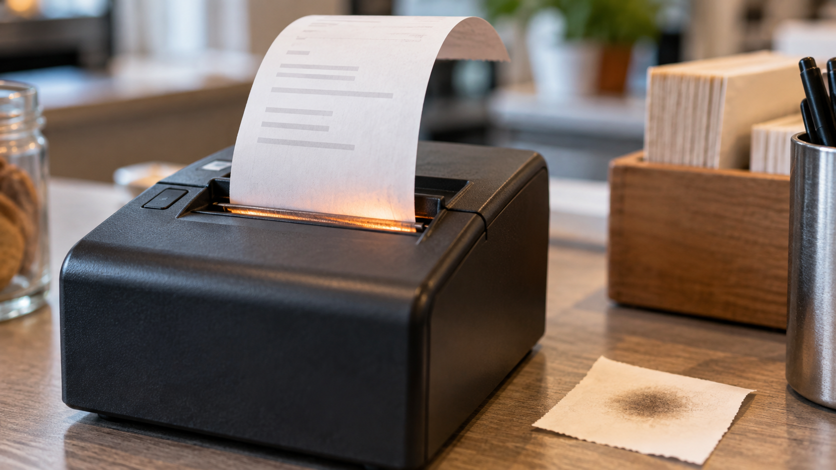
The Receipt Was Never Printed With Ink
Most modern receipts are not printed with ink in the familiar sense. Thermal paper carries its own chemistry, waiting for heat to turn a hidden image black.
A receipt feels like one of the least magical objects in modern life. It appears with a small cough from the register, curls in the hand, proves a transaction, then spends the rest of its brief existence fading in a pocket, glove box, kitchen drawer, or expense folder. But the receipt is stranger than it looks. In many cases, it was never printed with ink. The familiar cash register receipt is usually made from thermal paper. The printer does not press wet ink onto the surface. It uses a heated print head to activate a coating already built into the paper. The paper carries the possibility of text before the purchase happens. Heat simply reveals which parts of that possibility should turn dark. That is why a receipt can be blackened by the wrong kind of accident. Leave one on a dashboard, touch it with a hot mug, run it through enough friction, or wave it near a heat source and the blank spaces may darken. The paper is not reading the receipt back to you. It is reacting. Thermal paper typically contains a colorless dye, often described as a leuco dye, along with a developer and other ingredients that help the reaction happen at useful temperatures. The U.S. Environmental Protection Agency's assessment of thermal paper chemistry describes the printing event as a heat pulse that melts components in the coating and triggers a proton transfer from developer to dye, changing the dye's structure so a visible color forms. That is a lot of chemistry for a grocery total. The elegance of the system is obvious from the retailer's side. Thermal printers can be fast, quiet, compact, and mechanically simpler than printers that need ribbons, toner, or liquid ink. The same basic logic supports receipts, tickets, shipping labels, medical charts, parking slips, and the tiny documentary debris of daily commerce. The paper and printer split the work neatly: the printer supplies patterned heat, the paper supplies the image chemistry. The tradeoff is that the image is not especially loyal. A receipt is a record made by a reversible-feeling trick, even when the exact chemistry is more complicated than a simple on-off switch. Heat, sunlight, oils, plasticizers, moisture, abrasion, and time can degrade the image or darken the background. Anyone who has tried to return a purchase with a ghost receipt knows the experience: the paper exists, the memory exists, the evidence has politely left the room. This makes the receipt a useful little lesson in media. We tend to treat documents as containers for facts. A receipt says paid, date, amount, item, tax, last four digits, thank you. But the durability of those facts depends on the material carrying them. Thermal paper is excellent for the immediate ritual of commerce and mediocre for the emotional fantasy that every purchase record will remain legible in a drawer until tax season forgives us. The chemistry has another complication: bisphenols. For years, many thermal papers used bisphenol A, or BPA, as a developer. EPA's thermal paper alternatives project was created specifically to evaluate substitutes for BPA in thermal paper, including cash register receipts. BPA is not bound into thermal paper the way some additives are bound into plastic; it can be present in the coating and transferable through handling. That made receipts a small but real chemical exposure concern, especially for workers who handle them repeatedly. The replacement story is not tidy. Bisphenol S, or BPS, has often been used as an alternative, but regulators and researchers have treated that substitution cautiously. Minnesota's Pollution Control Agency notes that many receipts have been coated with BPA or BPS and that there are no known clearly safer alternatives across the board. EPA's own alternatives work identified possible substitutes but did not turn the receipt into a morally simple object. Sometimes progress in materials is not a clean escape from chemistry. It is a change in which unknowns get moved around. That does not mean every receipt should be treated like a crisis. It does mean the ordinary receipt is not just paper plus words. It is a designed chemical system optimized for speed, cost, convenience, and short-term legibility, with longer-term durability and exposure questions trailing behind it like the curled tail of the paper itself. There is a cultural reason this feels especially odd now. Receipts are proof, and proof is supposed to be serious. Yet the modern receipt is often physically unserious: easy to crumple, easy to lose, easy to fade, easy to decline at checkout, easy to replace with an email that may be harder to lose and easier to surveil. It is a document caught between eras. Paper enough to hand over. Digital enough in spirit to feel temporary. Chemical enough to blacken under a coffee cup. That tension explains why people keep receipts in such different ways. Some refuse them on principle. Some photograph them immediately. Some stuff them into wallets until they become a pale archaeological layer. Some keep every receipt because a future dispute, reimbursement, warranty, or return might demand a scrap of proof from a material never built for permanence. The thermal receipt is a quiet example of how modern convenience often hides inside material compromise. Inkless printing is not less technological than ink. It is more quietly technological: a surface engineered to wait, react, reveal, and eventually forget. The next time a receipt slides out warm from a register, it is worth noticing that warmth. It is not just leftover machine heat. It is the moment the document came into being: a small controlled burn without flame, chemistry turning into evidence, proof arriving already on its way to disappearing.

The Imaginary Sea That Runs Under Every Mountain
Sea level sounds like the simplest possible zero. In practice, surveyors rely on a gravity-shaped surface called the geoid: an imaginary ocean extended through land, mountains, valleys, and everything we build on top.
Sea level sounds like a clean fact. It is the place where the ocean sits. It is the zero on an elevation sign, the baseline in a flood map, the quiet assumption behind phrases like above sea level and rising seas. Then geodesy wanders in with a clipboard and ruins the simplicity in the most useful way possible. The surface used for precise elevations is not a perfectly smooth sphere, and it is not exactly the ocean you can stand beside. It is called the geoid: an imaginary surface shaped by Earth's gravity field that best fits global mean sea level. NOAA's National Geodetic Survey defines it in more formal language as an equipotential surface of Earth's gravity field, fitted as closely as possible to global mean sea level. That phrase sounds forbidding until the picture becomes physical. Imagine the ocean stripped of winds, tides, currents, waves, weather, and local sloshing. Now let that calm water spread through the continents as if land, rock, streets, basements, mountains, and parking lots were transparent to it. The resulting surface would undulate gently because gravity is not identical everywhere. That ghost ocean is the geoid. It is one of those concepts that feels absurd until you need it. A road has to drain. A bridge has to meet the ground where engineers say it will. A coastal community needs to know which houses are low. A construction project needs heights that mean the same thing from one side of a county to the other. GPS can tell you where you are on a mathematical ellipsoid, but people do not live on an ellipsoid. They live in gravity. The difference matters because height is not just geometry. A satellite receiver can estimate an ellipsoid height, which is your position relative to a smooth mathematical reference shape. But the elevation most people mean is an orthometric height: height above a level surface associated with mean sea level, following the direction gravity defines as up and down. To convert one into the other, surveyors need a geoid model. This is why the word level is sneakier than it looks. A carpenter's level does not point to a global sphere. It aligns itself with the local direction of gravity. A plumb bob does not care about a classroom globe. It points along the force field under its little brass conscience. The geoid is the large-scale surface to which those everyday instruments are spiritually related. Earth gives that surface a lumpy character because Earth itself is not arranged evenly. Mountains, ocean trenches, dense rocks, old ice-sheet depressions, mantle structure, groundwater changes, and other mass differences all tug on gravity. NASA's GRACE mission was built to detect tiny changes in Earth's gravity field from space by tracking the distance between two satellites as they chased each other around the planet. Where mass changes, gravity changes. Where gravity changes, our careful idea of level needs attention. The geoid is not lumpy in the theatrical way popular images sometimes imply. Those famous potato-looking Earth graphics are exaggerated so the variations can be seen. The real planet is still comfortably round to the eye. But for engineering, mapping, sea-level work, and navigation, small departures are not philosophical. They are the job. NOAA has been rebuilding part of that job for years. The agency's GRAV-D project, begun in 2007, set out to improve the American height system by collecting gravity data and building a better geoid model. The goal is practical: make accurate heights better, faster, and cheaper, so more elevation work can be tied to satellite positioning and modern gravity models rather than only to long chains of leveling observations. NOAA says the modernized National Spatial Reference System has been rolling out components for testing across 2024 through 2026, with tools and datum products being updated in stages. That sounds like a quiet bureaucratic migration, because it is. It is also infrastructure beneath infrastructure. A vertical datum is the zero surface against which heights are measured. Change the datum, and the mountain does not move, the harbor does not deepen, and your house does not rise on its foundation. What changes is the coordinate language used to describe where those things are. This can be disorienting. People like elevations to feel absolute. A summit sign says 6,288 feet and seems to be reporting a fact about the mountain's soul. In reality, an elevation is a measurement tied to a reference system, an instrument, a model, and a time. The mountain is real. The number is a careful agreement. That agreement has to be maintained because the Earth will not sit still for us. Land rises and sinks. Ice melts. Water moves. Earthquakes shift mass. Groundwater is pumped, stored, and lost. The ocean surface itself is not identical to the geoid because currents, temperature, salinity, winds, and other forces create ocean dynamic topography. Mean sea level changes over time. The zero line is not a line so much as a relationship under revision. The charm of the geoid is that it reveals how much hidden work is tucked inside the ordinary word height. When a mapping app gives an elevation, when a flood model draws a boundary, when an engineer asks whether water will flow the right way, the question underneath is not merely how far a point is from Earth's center. It is how that point sits in a gravity-shaped world. There is something almost tender about that. We talk as if sea level is where the ocean stops, but surveyors carry the sea inland. They run it under wheat fields and culverts, through office towers and granite ridges, beneath sidewalks and airport runways, under the feet of people who may live hundreds of miles from the nearest tide gauge. The sea becomes a reference surface, a shared imaginary plain that lets everyone argue less disastrously about up and down. The next time a road sign announces elevation, it is worth hearing the hidden sentence behind it. This place is this high above a surface no one can see, shaped by gravity no one can feel changing, maintained by measurements most people will never notice. The number looks simple because a great deal of complexity has been politely buried underneath it. That is the geoid's peculiar gift. It makes the planet measurable without pretending the planet is simple.

The Broadband Label That Tries to Make Internet Plans Sit Still
The FCC's broadband consumer label borrows the visual language of food packaging for something far less tangible: the monthly promise that your internet plan will cost, perform, and behave the way it says it will.
The most revealing label in a household may not be on cereal, medicine, or a breaker panel. It may be hiding on an internet provider's website, attached to a plan name that sounds like a weather event or a minor superhero: Gigabit, Extreme, Pro, Plus, Ultra, Max. The label is called Broadband Facts. It looks deliberately familiar: black lines, boxed categories, plain headings, the visual grammar of a Nutrition Facts panel. But instead of calories and sodium, it lists monthly price, fees, typical download and upload speeds, latency, data allowance, contract terms, and links to network management and privacy policies. That resemblance is the whole strategy. The Federal Communications Commission's broadband consumer label tries to turn an internet plan from a sales atmosphere into a standardized object. Here is what it costs. Here is the introductory rate, if there is one. Here is what happens after the introduction ends. Here are the extra charges and terms that tend to appear after the ad has already done its smiling. Internet service is slippery to buy because the product is partly invisible. A cereal box can be picked up and compared to another cereal box under fluorescent lights. Broadband is sold through availability checks, address forms, bundles, promotions, equipment rentals, taxes, fees, temporary discounts, and performance claims that depend on network conditions and hardware the customer may not control. The label's first achievement is almost embarrassingly basic: it makes the plan pause long enough to be inspected. Under FCC rules, providers must create and display an accurate label for each stand-alone mass-market broadband service currently offered for purchase. The label has to be publicly available, easily accessible, and shown at the point of sale, including websites, stores, third-party retail locations, and phone sales channels. For websites, the rule ties the label to the moment a consumer is comparing plans available at a service location, not some abstract corporate disclosure page discovered after three footer clicks and a search-engine apology. That location detail matters. Broadband prices and availability are local. The offer in one neighborhood may not be the offer in another. The plan a provider advertises nationally may be less useful than the terms available at a particular address. A good label is not just a disclosure; it is a receipt before the purchase. It is also a small admission about how hard comparison shopping has become. Broadband plans often compete through headline download speed, but download speed is only one part of the lived service. Upload speed matters for video calls, cloud backups, livestreaming, and sending large files. Latency matters for gaming, remote work, telehealth, and any interaction where delay makes a connection feel mushy. Data allowances matter because an unlimited-looking plan may have limits, throttling, or charges after a threshold. There is a nice brutality in that. Marketing wants adjectives. The label wants fields. The label also shows why standardized disclosure is always partly a design problem. Too little information and the label becomes decorative compliance. Too much and it becomes another wall of small print, technically available and practically unread. The FCC has already been revising the rules around that tension. In July 2026, the Commission adopted changes intended to simplify broadband label requirements, and the Federal Register published the final rule on August 13, 2026. Some provisions were effective September 14, 2026, while key amendments to section 8.1(a) were delayed until a later Federal Register notice. The direction of those changes is telling. The FCC moved to let providers describe label information over the phone in a more natural style rather than requiring a verbatim recitation. It adopted a way to simplify certain passthrough-fee presentations. It removed outdated Affordable Connectivity Program information from the label because that program ended in 2024. It also moved toward allowing hyperlinks or icons at points of sale and account portals in some circumstances, and eliminating requirements for machine-readable label spreadsheets and two-year archives of discontinued labels. That is where the label becomes more than consumer paperwork. It exposes a quiet policy fight over what kind of transparency counts. A human-readable label helps the shopper who is looking at a plan right now. A machine-readable dataset helps third parties, watchdogs, researchers, comparison tools, and anyone trying to study the market at scale. An archive helps with old-plan disputes and historical accountability. A hyperlink can reduce clutter, but it also asks the shopper to click. A full label placed beside a plan is harder to miss, but it can crowd a sales page. Every version of transparency has a user in mind, and every user imposes a cost on someone else. That does not make the label useless. It makes it honest about the bargain. The Broadband Facts panel is not an all-seeing instrument. It will not tell you whether your apartment's wiring is tired, whether your router is poorly placed, whether evening congestion will annoy you, or whether customer service will become a small weather system in your week. It cannot turn a weak local market into a competitive one. But it can make a plan less vaporous. It can put the monthly price, recurring fees, one-time fees, typical speeds, latency, data terms, and contract warnings into a shared format. It can give a customer something to compare against the first bill. It can make the familiar sales phrase "up to" share space with the less glamorous word "typical." That word is the soul of the thing. Typical is not perfect. It is not a promise that every speed test will behave. But it is more useful than the heroic maximum. Broadband advertising has long loved the ceiling. The label asks about the room people actually live in. There is a broader pattern here: the modern world is full of small labels trying to make systems legible. Energy labels turn appliance efficiency into a number. Food labels turn ingredients and nutrients into a ritual of inspection. Product passports may soon turn objects into data records. The broadband label does something similar for a service that usually arrives as a monthly charge and a vague household mood. It gives the internet plan a front and a back, even though there is no box to hold. That may be why the nutrition-label metaphor works better than expected. No one believes a food label captures the whole meal, the farm, the supply chain, the recipe, or the body's response. It captures enough to make comparison possible. The broadband label is modest in the same way. It does not make internet service simple. It gives complexity a place to sit down and answer a few direct questions.

The Little Circle That Tells You What a Cardboard Box Can Survive
That printed circle on a cardboard box is not decoration. The box maker's certificate is a compact shipping promise about strength, weight limits, and what the package was built to endure.
The most honest label on a cardboard box is usually not the shipping label. That one tells a carrier where the box should go and gives the tracking system something to chew on. The quieter label is often printed on a bottom flap or side panel: a small circular or rectangular stamp with phrases like box maker's certificate, edge crush test, bursting test, gross weight limit, and size limit.
It looks like packaging boilerplate, the kind of industrial fine print that becomes invisible the moment a box arrives at the door. But the stamp is doing something specific. It is the box telling the freight system what kind of body it has.
A corrugated box is a strangely optimistic object. It is light, cheap, recyclable, foldable, printable, and mostly made of paper. Then modern logistics asks it to protect a coffee grinder, books, shoes, medicine, computer parts, jars, cables, dishes, and things that should never have been sold with so little cushioning in the first place. The box maker's certificate, often shortened to BMC, is one of the ways the system tries to keep optimism from becoming fraud.
The certificate identifies the manufacturer and gives standardized information about the board and the box's tested strength. In the United States, those certificates are tied to freight classification rules maintained by the National Motor Freight Traffic Association and reproduced by the Fibre Box Association for the corrugated industry. The exact language varies by whether the box qualifies under a bursting test, an edge crush test, or related requirements, but the logic is consistent: the box is declaring a performance category.
Two strength ideas appear again and again. The bursting test, often associated with the Mullen test, measures how much pressure it takes to rupture the corrugated board. It is a puncture-and-tear kind of question: how hard must the world push before the wall gives way? The edge crush test, or ECT, measures how much force a sample can withstand on its edge. It is more directly tied to stacking strength: how much vertical compression can the material resist before it buckles?
Those are not the same promise. A box can be decent at one form of punishment and less impressive at another. UPS packaging guidance lists both bursting strength and ECT values in its box strength guidelines, matching them to weight and size ranges. For many ordinary single-wall cartons, 200-pound bursting strength and 32 ECT are familiar baseline figures, but they are not interchangeable expressions of the same physics. The box's material, flute structure, liners, dimensions, closure, contents, and cushioning all matter.
This is why a damaged package often produces arguments that sound moral but are really mechanical. The sender says the box looked sturdy. The recipient says the carrier must have abused it. The carrier points to packaging guidelines. Somewhere underneath is the less emotional question: was the box rated, packed, cushioned, sealed, and sized for the trip it was asked to take?
The BMC is useful because it makes at least part of that question inspectable. It usually includes the box maker's name and location, the board construction, the maximum gross weight the box is rated to carry, and the maximum outside dimensions or size limit. If it is an ECT-rated box, it gives an edge crush value such as 32 ECT, 44 ECT, or higher. If it is a bursting-test box, it gives a bursting strength such as 200 pounds per square inch. In a world where many products arrive in boxes inside boxes, the certificate is a tiny survival profile printed on the skin.
That profile does not guarantee safe arrival. A box can be strong and still fail if it is underfilled, overfilled, badly taped, crushed by a heavier package, soaked, reused too many times, or forced to protect a dense object with sharp corners and no padding. UPS tells shippers to choose a rigid box with flaps intact, avoid exceeding the maximum weight limit printed on the bottom flap, cushion items properly, and use shipping tape rather than household improvisations such as string, paper over-wrap, masking tape, or cellophane tape. The certificate is not a force field. It is a minimum vocabulary for strength.
This distinction matters more than it used to because the ordinary consumer box has been recruited into an extraordinary delivery system. E-commerce turned millions of households into the final receiving docks of retail logistics. People now judge a seller, a carrier, and sometimes the universe by the state of a corrugated carton on the porch. Yet the box itself remains mostly ignored unless it fails. We notice cardboard when it tears, caves in, smells damp, arrives as a parallelogram, or reveals that someone shipped a fragile object with the protective philosophy of a sandwich bag.
The box maker's certificate belongs to a family of boring marks that make modern life possible: tire sidewall codes, elevator inspection certificates, electrical listing marks, laundry symbols, food lot numbers, pallet stamps. They are not written for romance. They exist because at scale, systems need standardized ways to express trust. A carrier cannot individually deliberate over the personality of every carton. It needs rules, ratings, and repeatable tests.
There is also an ecological texture here. Corrugated packaging has real environmental advantages when it is recovered and recycled, but that does not make every box virtuous by default. A weak box can fail and destroy the thing inside, which is its own waste event. An overbuilt box can use more material than necessary. A properly rated box is not just stronger; it is more honest about the job it is supposed to do. Good packaging is a negotiation between protection, weight, cost, material, and the abuse curve of the delivery network.
That negotiation is why the stamp is worth reading once. Not every package needs industrial paranoia. A sweater and a ceramic lamp do not ask the same things of cardboard. A 12-pound box of books and a 12-pound object with one sharp metal corner are different in transit, even if the scale says they weigh the same. The BMC will not solve the whole packing problem, but it tells you whether the carton has at least introduced itself truthfully.
The next time a delivery box is headed for the recycling bin, flip it over before flattening it. There may be a small printed certificate hiding on a flap, full of numbers that look dull until you imagine the box's recent life: conveyors, drops, trucks, humidity, other packages leaning on it, human hands moving too quickly. The circle is not a decoration. It is the box's little resume, a claim about what this temporary paper structure was built to survive.

The Extra Second That Computers Would Rather Forget
Leap seconds were invented to keep atomic time close to the spinning Earth. Now the tiny correction is being phased out because modern infrastructure dislikes time that hiccups.
The strangest second on the clock is named 23:59:60. It does not appear in normal life. Most clocks never show it. Many people will never notice whether it has happened. And yet for half a century, this extra second has been one of the small agreements keeping official time tied to the actual rotation of the Earth. A leap second is not a poetic flourish. It is an engineering compromise. Coordinated Universal Time, or UTC, is based on atomic clocks, whose seconds are far steadier than the Earth itself. The planet, rude old mechanism that it is, does not rotate at a perfectly constant rate. It is affected by tides, the atmosphere, the oceans, the motion of the core, and other restless parts of the physical world. Astronomical time, known as UT1, follows that rotation. UTC follows atomic time but has historically been nudged by leap seconds so it does not drift more than about 0.9 seconds away from UT1. That is the elegant version. The inelegant version is that every so often the world's official timekeeping system has asked digital infrastructure to tolerate a minute with 61 seconds in it. The practice began in 1972, after a ten-second adjustment was made to UTC, and the International Earth Rotation and Reference Systems Service has since announced leap seconds when Earth's rotation and UTC needed to be pulled closer together. NIST explains the basic ritual plainly: positive leap seconds have been inserted at the end of a UTC day, usually in June or December, using the sequence 23:59:59, then 23:59:60, then 00:00:00. There is also a provision for a negative leap second, which would remove a second, though one has never been used. That last detail is where the story gets twitchy. All leap seconds so far have been positive. The software world has had enough trouble with those. A negative leap second would be a new species of clock event: instead of briefly repeating or stretching time, the clock would skip ahead. In 2022, the General Conference on Weights and Measures, the international body behind the metric system, formally noted that recent observations of Earth's rotation indicated the possible need for the first negative leap second, whose insertion had never been foreseen or tested. That is metrology language for: we should perhaps not learn this live. So the leap second is now on borrowed time. At its 27th meeting in 2022, the General Conference decided that the maximum allowed difference between UTC and UT1 will be increased in or before 2035. In practical terms, that means leap seconds are expected to stop being inserted for at least a long stretch. The body asked for a plan that would keep UTC continuous for at least a century, with the details to be proposed for agreement at the 28th meeting in 2026. This is not because anyone discovered that the Earth has become punctual. It is because global systems have become less tolerant of tiny discontinuities. The official resolution names the problem directly: leap seconds create discontinuities that risk serious malfunctions in critical digital infrastructure, including satellite navigation systems, telecommunications, and energy transmission. It also points to another, quieter problem. Different operators have invented different ways to handle leap seconds, and those uncoordinated methods threaten the shared meaning of UTC. The hidden comedy of modern time is that many computers do not simply experience a leap second. They negotiate it. Some systems step the clock. Some smear the leap second across a longer period. Some need careful configuration to avoid mixing smeared and unsmeared time sources. Google says it has used a leap smear since 2008, gradually distributing the extra second across the hours before and after the event instead of making servers swallow an abrupt clock step. Its public description recommends a 24-hour linear smear from noon to noon UTC and notes that smeared time temporarily differs from UTC before realigning. That is a practical solution, but it is also a small philosophical scandal. For a day, two systems can both be doing something defensible and yet disagree slightly about what time it is. One is honoring UTC's leap second directly. Another is smoothing the bump so distributed computing remains calm. The point of clocks, as Google dryly observes in its own explanation, is to read the same time in different places. Leap smearing helps machines, but it also reveals that shared time is a service, not a substance. The costs are not merely theoretical. When the leap second at the end of 2016 arrived, Cloudflare later described how part of its DNS infrastructure ran into trouble because code used a clock source that could move backward. A negative time difference leaked into server selection logic, causing errors until engineers deployed a fix. The postmortem is wonderfully specific in the way infrastructure failures often are: not a civilization-ending drama, just a small assumption about time meeting a rare calendar event at midnight UTC. That is why leap seconds make such good Side Column material. They are tiny enough to seem ridiculous and fundamental enough to touch everything. Your phone, bank transaction, map app, power grid monitor, server log, airline system, and telescope schedule all participate in some version of the same bargain: time must be stable enough for machines, but recognizable enough for humans living under a rotating sky. For astronomers and some scientific users, the connection between civil time and Earth rotation is not decorative. If leap seconds go away, UTC will slowly drift farther from UT1. The change will be tiny for everyday purposes. One second of drift is not a lunch plan ruined by the heavens. But over long periods the difference matters to fields that care where the Earth is pointing. NIST notes that if UTC were no longer corrected, the smaller community needing UT1 could use published corrections instead. That is the likely cultural trade: stop forcing every system to absorb occasional clock discontinuities, and ask specialized users to apply the correction they actually need. There is something revealing in that redistribution of burden. Leap seconds once made the sky's irregularity everyone's problem, whether everyone knew it or not. Ending them would make continuous atomic time the default and put astronomical correction where it is most needed. That is not anti-nature. It is an admission that modern civil time is already an interface layered over physics, law, engineering, and habit. The next few years will decide the details, not the emotional truth. As of the U.S. Naval Observatory's current leap-second announcement, no leap second will be introduced at the end of December 2026, and the last positive leap second was inserted at the end of December 2016. We may already have lived through the final ordinary leap second, though that is not guaranteed until the international process finishes its work. If that was the last one, it left very quietly: a one-second pause tucked into New Year's Eve for UTC, noticed mainly by people paid to keep the world's clocks from arguing. That seems about right. The leap second was always a tiny act of humility before a messy planet. Its likely retirement is a different kind of humility: admitting that the systems built on top of time now need the clock to stop flinching.
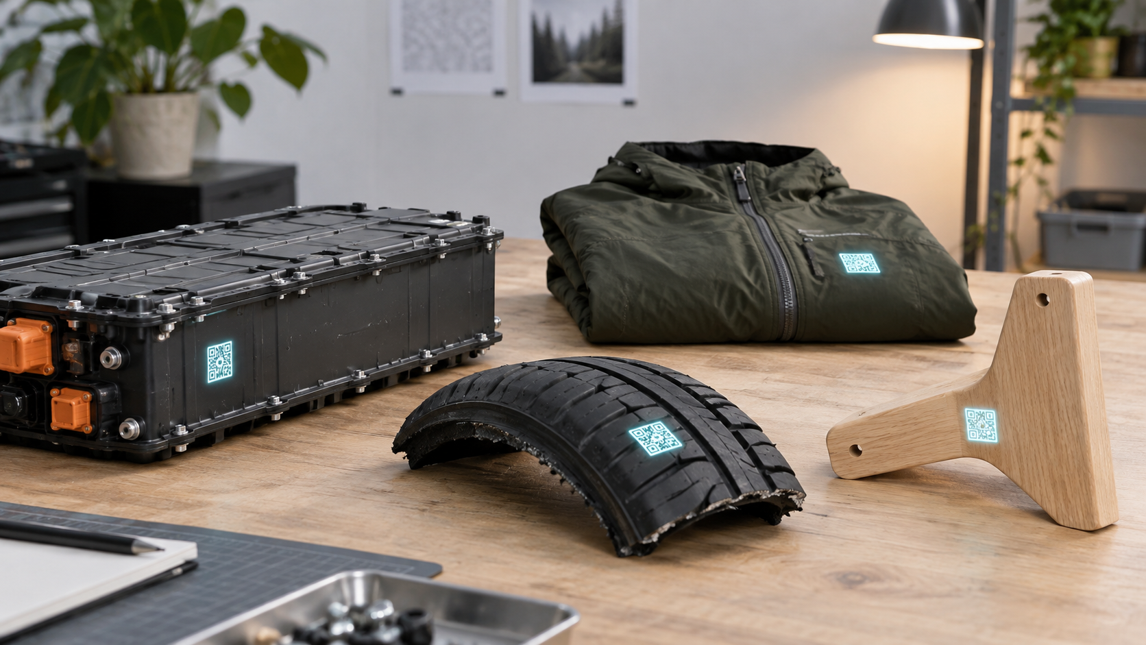
The QR Code That Wants to Give Every Object a Memory
Europe’s Digital Product Passport sounds like bureaucratic plumbing. It is also a glimpse of a future where batteries, textiles, furniture, and other everyday objects may have machine-readable biographies.
The most interesting label on a product used to be the one that told you what it was. A size tag. A nutrition panel. A serial number tucked behind a battery door. A warning sticker that seemed to have been written by both an engineer and a lawyer after a long lunch. The next important label may not explain much by itself. It may be a QR code or another data carrier that points somewhere else: to a structured digital record of what the object is, who placed it on the market, what materials it contains, how it performs, and what should happen when it breaks, wears out, or needs to be recycled. That is the basic idea behind the European Union's Digital Product Passport, usually shortened to DPP, a phrase so dry it practically arrives wearing a lanyard. But under the dull name is a genuinely odd shift. Europe is building the legal and technical infrastructure for ordinary physical things to carry machine-readable biographies. Not just expensive things with serial numbers. Not just devices that connect to the internet. Things: batteries first, then categories such as textiles, iron and steel, aluminium, tyres, furniture, mattresses, information and communications technology products, and more as the rules develop. The passport is not a consumer gadget feature. It is a compliance system with a circular-economy ambition. The European Commission describes the DPP as a digital container for information about products, components, and materials, intended to support sustainability, circularity, and legal compliance. Depending on the product group, that information may include safety, origin, materials, repairability, environmental performance, reuse, and recycling details. The design implication is sharper: the object on the shelf is no longer expected to tell its story only through packaging, branding, and whatever the seller volunteers. It may be required to have a data shadow. The timing has moved from concept to infrastructure. On July 20, 2026, the European Commission launched the Digital Product Passport Registry and a testing environment. The registry does not store every detail about every product. The broader system is decentralized, with detailed product information maintained by the economic operator or a DPP service provider. The registry stores unique identifiers and required metadata, creating a way to register and verify that a passport exists. In plain language: the EU is not merely telling companies to make better labels. It is building the index cards for the filing cabinet. Batteries are the first major test because batteries are no longer background objects. They sit inside electric vehicles, e-bikes, scooters, home storage systems, industrial equipment, and the larger electrified promise of modern life. They also contain complicated materials, performance histories, safety considerations, and end-of-life value. Under the EU Batteries Regulation, certain categories are scheduled to need a battery passport from February 18, 2027. The Commission says that passport will be linked to the battery through a QR code and may include identification, technical characteristics, manufacturer information, performance and durability data, and information supporting repair, reuse, and recycling. This is where the story becomes more interesting than a sustainability checkbox. A battery passport is useful only if it can be understood by different parties for different reasons. A consumer may want durability information. A recycler may need chemistry and disassembly details. A regulator may need compliance evidence. A customs authority may need to know whether an imported product has a valid registration. A manufacturer may want the system to work without revealing commercially sensitive information to every curious scanner in a store aisle. So the DPP is not really one interface. It is a stack of permissions, identifiers, standards, product-specific rules, and databases pretending, from the outside, to be a humble little code. Scan the carrier, and different users may see different information depending on their role and the relevant law. That small square on a product becomes a doorway with a bouncer. This is why the standards work matters. CEN and CENELEC, the European standardization bodies, said in July 2026 that a joint technical committee had developed a first series of eight European standards covering essential aspects of the DPP system. The Commission's registry launch noted that six harmonized standards were already available, covering areas such as unique identifiers, interoperability, data carriers, APIs, data exchange protocols, and data storage. Without that plumbing, a product passport risks becoming incompatible PDFs and marketing pages with QR codes glued on top. The passport also exposes a tension built into modern product information. We often talk as if transparency were simply a matter of revealing facts. But useful transparency requires structure. A vague green claim on a tag is easy to print and hard to compare. A structured data field is harder to assemble but easier to check, transmit, filter, and reuse. The DPP's ambition is to make product information less like a brochure and more like infrastructure. That does not mean the result will automatically be elegant, trusted, or useful to ordinary people. Regulations can create paperwork that technically exists and practically gathers dust. QR codes can become portals to dead pages, legal fog, or cheerful sustainability theater. The DPP will depend on data quality, product-specific rules, enforcement, interface design, and whether the information shown to users answers real questions rather than satisfying a spreadsheet. Still, the concept has a certain quiet force. A label has always been a compact argument about what deserves to be known. Food labels made calories, ingredients, and allergens part of everyday inspection. Energy labels turned appliance efficiency into a visible buying signal. Serial numbers made ownership, repair, warranty, and recall systems possible. The Digital Product Passport belongs to that family, but it points at a broader ambition: to make an object's afterlife legible before the object becomes waste. Consider a jacket. Today, a shopper may see fabric percentages, washing instructions, country of origin, maybe a recycled-content claim and a brand story about responsibility. Under future DPP requirements for textiles, the relevant details are still being developed, so it would be wrong to pretend we know exactly what every garment passport will contain. But the category is on the Commission's timeline for sector-specific requirements in 2027. The point is not that every shopper will suddenly study supply-chain metadata before buying socks. Most will not. The point is that repairers, resellers, recyclers, customs systems, marketplaces, auditors, and more determined consumers could be reading from a common product record instead of a patchwork of tags, declarations, and corporate web pages. That could change incentives in small ways before it changes behavior in grand ones. If a product must carry structured claims about materials, durability, repair, or recycling, those claims become easier to compare and harder to bury. If marketplaces must make passports accessible for products sold into the EU, online shopping pages may inherit a new layer of product identity. If customs can check a registration identifier, the border becomes one more scanner in the object's life. The object becomes less anonymous. There is a less romantic version too. More data can mean more compliance cost, more vendor software, more consultants translating factories into fields. Smaller businesses may find the transition heavier than large companies with mature data systems. Consumers may be offered information without meaningful choice. And because the rules are rolling out by product group through delegated acts and other legislation, the full shape of the system will arrive unevenly. The passport for a large battery is not the same problem as the passport for a shirt, a tyre, or a sofa. But the direction is clear enough to notice. For decades, many products have become informationally richer after purchase only when they fail: the recall notice, the repair forum, the recycling confusion, the impossible search for a model number printed in gray on black plastic. The Digital Product Passport tries to move some of that knowledge upstream. It asks the object to arrive with more of its own administrative future attached. That is the strange charm of it. The DPP is policy plumbing, yes. It is also a new kind of product language, one that treats an object not as a silent finished thing but as a participant in systems of maintenance, accountability, reuse, and disposal. A QR code is a small, familiar square. Behind it may be a larger cultural adjustment: the expectation that a thing should be able to say what it is made of, where it belongs, and what it needs next.

Marginalia Integrated Draft Test 20260924235010
An integrated workflow test verifying Marginalia Reed’s autonomous Side Column publishing process.
This is an integrated Side Column publishing workflow test created by Marginalia Reed. It verifies title, body, author, excerpt, URL, featured image, SEO metadata, and draft persistence.

Uber's Biggest Problem: Customer Service
Uber's technology is impressive. Its customer service is not.
Nearly 20 years after creating an account, I still have an outdated profile photo because I've never been able to get Uber to remove it. The issue isn't really the photo anymore - it's what it says about accountability, support, and a system that often seems designed to avoid ownership when something goes wrong.
With alternatives like Waymo, scooters, bikes, and public transit becoming more common, customer service may become just as important as convenience.
Nearly two decades ago, I explored becoming an Uber driver. I never drove a single ride.
Yet I still have a nearly 20-year-old profile photo on my account because I've never been able to get Uber to remove or update it.
What makes this particularly frustrating is that it shouldn't even require customer service. Most modern apps allow users to update or delete a profile photo themselves. Somehow, after all these years, Uber still has an outdated image attached to my account and provides no simple way for me to remove it.
Over the years, I submitted requests and attempted to contact support. The result was always the same: automated responses, help articles, redirects to other parts of the website, and ultimately no resolution. Not only was the problem never fixed, I rarely received a meaningful response at all.
The issue isn't really the photo anymore. The photo is just evidence of a larger problem. If a company cannot solve something as simple as removing an outdated profile picture over the course of twenty years, what confidence should customers or drivers have when dealing with a serious issue involving payments, safety concerns, account access, or disputed charges?
The most frustrating part isn't being told "no." It's feeling like nobody at the company ever took ownership of the issue in the first place.
And this isn't just a customer complaint.
Spend a few minutes reading online discussions from drivers and you'll find many expressing similar frustrations. Account verification issues, document reviews, payment questions, deactivations, background-check delays, and support tickets that seem to disappear into a black hole are recurring themes. Whether every complaint is justified is almost beside the point. The common thread is that many people feel they can't reach someone empowered to actually solve a problem.
The irony is that Uber built its reputation on convenience. Need a ride? Open an app. Need food delivered? Open an app. Need transportation almost anywhere in a city? Open an app.
Until something goes wrong.
Then the experience often changes from convenience to confusion. Users find themselves navigating help articles, chat systems, automated menus, and endless redirects. The technology that makes everything so easy when it works can become a barrier when it doesn't.
For years, Uber could get away with that because there weren't many alternatives.
Today there are.
Around Denver, Waymo vehicles are becoming more common every month. Whether autonomous vehicles ultimately dominate the market or not, they represent competition. More importantly, they represent choice.
Then there are alternatives many people overlook entirely. Recently I took an Uber during rush hour for a trip of roughly 1.5 miles. The fare was somewhere around $10 to $15. The same trip on a Veo electric scooter or bike could have been completed for roughly $3.
Obviously scooters aren't practical for every trip, every person, or every weather condition. But that's not the point.
The point is that consumers have more options than ever before.
Ride-share companies don't just compete against other ride-share companies anymore. They compete against electric scooters, electric bikes, public transportation, autonomous vehicles, walking, and whatever transportation technology comes next.
When customers have choices, customer service becomes more important—not less.
The biggest threat to Uber may not be Waymo. It may not be scooters. It may not even be another ride-share company.
The biggest threat to Uber may be the growing realization that when people need help, there are now plenty of other ways to get where they're going.
Technology can automate rides. It can automate payments. It can automate account management.
But it cannot automate accountability.
And that's where Uber still has work to do.
Masters of the Universe Deserves Better
For decades, Masters of the Universe fans kept the power alive when there were no movies, no major media attention, and little reason to believe Eternia would ever return to the big screen.
Now it finally has.
This isn't just a movie review. It's about fandom, imagination, toys, heroism, and why He-Man still matters after all these years.
Masters of the Universe deserves better.
If you're a longtime Masters of the Universe fan, you've probably already seen the movie. Maybe twice. Maybe three or five times.
That isn't unusual in this fandom.
Jeremy DeWitt and Steve Boshotti of Podcasters of the Universe (POTU) have reportedly seen the film multiple times already, and many dedicated fans are doing the same. But their contribution to the franchise goes far beyond buying movie tickets.
For years, when Masters of the Universe wasn't receiving major theatrical releases or constant media attention, fans like Jeremy and Steve kept the spirit of Eternia alive. Through Podcasters of the Universe, they built a welcoming community where longtime fans and newcomers alike could celebrate the franchise.
Jeremy has often been the creative force behind many of the ideas that helped keep fans engaged. He is an accomplished musician and possesses one of the most recognizable Skeletor impressions in the fandom. It's not trying to imitate someone else's version. It's uniquely Jeremy's own, and longtime listeners know exactly what I'm talking about.
Steve brings a different energy. His booming He-Man voice and enthusiasm for the franchise have become hallmarks of the show. And Steve understands something many outsiders miss about Masters of the Universe. The franchise is wholesome, optimistic, family-friendly, and full of positive messages, but it's also unapologetically sexy.
As Steve likes to say:
"Skies out, thighs out."
And honestly, he's not wrong.
Masters of the Universe has always been filled with larger-than-life heroes, villains, warriors, sorceresses, and adventurers. Muscles. Capes. Armor. Fur boots. Bare arms. Bare legs. Nice butts. Giant swords. Ridiculous confidence.
The funny thing is that the new movie only partially embraces that tradition. He-Man himself gets the classic minimally attired treatment, but most of the other characters were toned down. That's understandable from a Hollywood perspective, but part of the charm of Eternia has always been that everyone looked like they belonged in the same wonderfully over-the-top fantasy world.
One could argue the movie missed an opportunity there.
If you're going to embrace the wild spirit of Masters, embrace it for everyone.
The heroes look heroic.
The villains look villainous.
Everyone looks ready for battle, a bodybuilding competition, or both.
Side note: I wouldn't have complained if He-Man had about 60 more pounds of muscle. Come on, CGI. This was your moment.
That's part of what makes Eternia feel like Eternia.
And somehow, despite all the outrageous designs, Masters remains surprisingly wholesome.
That's one reason the current movie means so much to so many people.
It isn't simply another movie release.
It's the payoff for decades of loyalty.
Which is why the disappointing box office performance so far has been difficult to watch.
What's especially frustrating is seeing other films thrive despite mediocre reviews and weak audience scores while Masters struggles to find an audience. Meanwhile, fans who actually showed up are discovering a movie that embraces adventure, optimism, heroism, and heart.
The film remembers what made Masters special.
At its core, Masters of the Universe has never really been about muscles, swords, or magic castles.
It's about courage.
It's about choosing what's right when it would be easier to choose yourself.
He-Man isn't cynical.
He isn't dark.
He isn't an antihero.
He's a genuinely good person entrusted with incredible power who chooses responsibility over selfishness. In an era where many heroes are morally gray, there is something refreshing about a character who simply wants to protect others.
Kids deserve heroes like that.
Families deserve stories like that.
And perhaps that brings us to a larger question.
What happened to wonder?
Many of us grew up in an era when toys weren't just products.
They were gateways.
A child could pick up a He-Man figure, a Battle Cat, a Castle Grayskull, and spend an entire afternoon creating stories. Entire universes existed in our imaginations.
Today, many children spend more time looking at screens than toy shelves. Many toys struggle to compete with phones, tablets, and endless streams of content. The idea of sitting on the floor creating adventures with action figures feels increasingly rare.
Yet Masters of the Universe still represents something unique.
It invites imagination.
It encourages creativity.
It asks children and adults to build worlds in their minds.
That's one reason the toy line has endured for over forty years.
The remarkable thing is that fans never stopped supporting it.
Mattel continued releasing new versions of the characters through line after line of collectibles.
Masters of the Universe Classics.
Origins.
Masterverse.
Anniversary releases.
Convention exclusives.
Deluxe figures.
Vehicles.
Playsets.
And perhaps most impressively, the premium Mondo line, featuring enormous, highly detailed figures that many fans once thought would never exist.
Have all of them been perfect?
Of course not.
Masters fans have joked for years that getting He-Man's face right may be one of the hardest jobs in the toy industry. Sometimes a figure looked incredible from the neck down, only for the face sculpt to make him appear as though he had undergone questionable cosmetic surgery somewhere in Eternia.
And yet fans kept buying.
Because they weren't simply buying plastic.
They were buying memories.
They were buying possibilities.
They were buying a connection to stories and characters that meant something to them.
I know I was.
Like many fans, I've purchased multiple versions of He-Man, Skeletor, Battle Cat, and countless others over the years.
Not because every figure was perfect.
Because Masters mattered.
And perhaps that's another reason this movie deserves support.
We've supported the cartoons.
We've supported the comics.
We've supported the toys.
We've supported the podcasts.
We've supported the conventions.
We've supported the franchise through years when there was little reason to believe a major theatrical movie would ever happen again.
Now that it finally exists, we'd like to see the story continue.
And there is so much potential.
A second film centered around She-Ra could be exactly what the franchise needs. It would introduce one of the strongest female heroes in fantasy and potentially bring in audiences beyond the Gen X men who largely carried the brand for decades.
She-Ra isn't simply a spin-off.
She's one of the most important characters in the entire mythology.
A successful sequel could expand the audience dramatically and help prove that Masters of the Universe belongs to everyone, not just nostalgic collectors.
Then imagine a third film.
He-Man and She-Ra standing together.
Brother and sister united.
Eternia facing its greatest threat.
Perhaps Hordak emerges as the larger danger.
Perhaps Skeletor rises again after suffering defeat.
Perhaps the sibling team-up fans have waited decades to see finally arrives.
That's the trilogy many fans dream about.
And honestly, it deserves the chance to exist.
Even the theater experience itself has been special.
The merchandise alone has been incredible.
Light-up Skeletor popcorn buckets with glowing red eyes.
Battle Cat collectibles.
Giant Power Sword drink holders.
Castle Grayskull popcorn containers complete with a working drawbridge.
Miniature Power Sword burger toppers.
The kind of movie swag that reminds you why going to theaters can still feel magical.
Walking into a theater and seeing Masters of the Universe merchandise front and center felt surreal after all these years.
But perhaps the biggest reason to support this movie is simpler than any box office number.
We often hear people say there are no original ideas anymore.
No family adventures.
No hopeful heroes.
No movies with heart.
Then when one arrives, audiences sometimes stay home.
Masters of the Universe isn't perfect.
No movie is.
But it is sincere.
It believes in heroism.
It believes in friendship.
It believes good can triumph over evil.
And maybe those ideas are worth supporting.
Maybe imagination is worth supporting.
Maybe wonder is worth supporting.
Maybe toys are worth supporting.
And maybe introducing a new generation to Eternia is worth supporting too.
For decades, action figures inspired children to tell stories, create worlds, and dream bigger than the rooms they played in. Masters of the Universe was one of the best examples of that magic.
Perhaps it still can be.
Maybe today's children don't buy toys the way previous generations did.
Maybe they never will.
But if enough people discover Eternia through this film, perhaps some of that magic can return. Perhaps a child picks up a He-Man figure, a Battle Cat, or a Skeletor for the first time and creates adventures of their own.
And if that happens, then Masters won't simply be surviving on nostalgia.
It will be creating new fans.
Just as it did for many of us all those years ago.
So this is a simple request.
If you grew up with He-Man, go see it.
If you have children, take them.
If you're looking for a fantasy adventure with heart, give it a chance.
And if you've never listened to Podcasters of the Universe, look them up. Jeremy DeWitt and Steve Boshotti are proof that fandom isn't just about consuming entertainment.
Sometimes it's about preserving it until the rest of the world catches up.
For decades, fans kept the power alive.
Now it's our turn to support the stories we've been asking for.
Because after all these years, Masters of the Universe finally returned.
I'd like to see it stay.

Against the Grain: The Art of Being Yourself
What’s called ‘normal’ is often just repetition at scale. It becomes powerful not because it’s right, but because it’s rarely questioned.
There is a constant pressure in modern life that rarely announces itself directly. It doesn’t shout or demand—it suggests. It nudges. It presents a narrow path and calls it “normal.” Over time, that path becomes so familiar that most people stop questioning whether it fits them at all.
Being yourself, fully and honestly, is not an act of rebellion in the dramatic sense. It is a sustained decision to live in alignment with your own instincts rather than default expectations. And in a world shaped by shared habits and cultural norms, that alignment can be difficult to maintain.
Take something as foundational as marriage. Society often treats it as a milestone—something you are expected to pursue, achieve, and maintain. But not everyone is wired for that structure. Some people thrive in independence, others in unconventional partnerships, and some simply do not feel the pull at all. Choosing not to marry, or not to follow the traditional model, can be seen as deviation when in reality it may be the most honest expression of one’s nature.
Even smaller, everyday behaviors carry this same pressure. Hygiene, for example, is not just about cleanliness—it is also about conformity. There is an expected “acceptable” smell, a routine of bathing, grooming, and presenting oneself in a way that signals social awareness. While basic hygiene has practical benefits, the line between health and expectation can blur. At times, people follow routines not because they serve them, but because they signal belonging.
Grooming standards—especially for women—offer another clear example. The expectation to shave legs, underarms, or maintain a certain polished appearance is often treated as natural, when it is in fact cultural. Choosing not to follow those norms can provoke disproportionate reactions, revealing how deeply these expectations are ingrained. What is framed as “preference” often operates more like an unspoken rule.
Then there are more private dimensions of identity, like attraction and desire. Cultural norms tend to define what is acceptable, appropriate, or “normal,” but human experience rarely fits into such clean categories. Expressing desires that fall outside of those norms—so long as they are healthy and consensual—requires a level of self-trust that many people never fully develop. The fear is not always about the desire itself, but about how it will be received.
Career paths are another powerful example. The traditional model—education, stable job, steady progression—still dominates expectations. But many people feel drawn to something less predictable: creative work, independent ventures, or unconventional lifestyles. Choosing that path often means stepping away from external validation and embracing uncertainty in exchange for authenticity.
Even how we spend our time is shaped by invisible standards. Productivity is often treated as a virtue in itself. Waking early, staying busy, optimizing every hour—these are celebrated behaviors. Yet not everyone thrives under constant output. Some people are more reflective, slower-paced, or cyclical in their energy. Choosing rest, or a different rhythm of life, can feel like falling behind when it may actually be a more natural way of operating.
Across all of these examples, the pattern is the same: there is a difference between what is common and what is true for you.
The cost of ignoring that difference is subtle but cumulative. It shows up as a sense that something is slightly off even when everything appears to be in place. Over time, those small misalignments can shape an entire life.
The alternative is not rejection of society, but conscious participation in it. It is the ability to recognize norms without being governed by them. To choose what fits, and discard what doesn’t, without needing permission.
This requires honesty—sometimes uncomfortable honesty. It requires the willingness to stand in decisions that others may not fully understand. And it requires trust in the idea that a life built on alignment will, in the long run, be more stable than one built on approval.
Being yourself is not about constant defiance. It is about consistency. It is about making choices that reflect who you are, even when those choices are invisible to everyone else.
And over time, that consistency becomes something solid—something that does not shift with trends or expectations. It becomes a kind of internal anchor.
Culture will always offer a script. But the most meaningful lives are rarely lived by following it word for word.

5 Things You Do That Are Basically Gambling
Most of us don’t gamble—we just make confident decisions with questionable odds.
We all like to think we’re making decisions.
But if we’re being honest… a lot of them are just bets with better lighting.
1. Buying Running Shoes Without Reading Reviews
You saw them online.
Clean. Fast. Athletic. Like they could change your life.
You guessed your shoe size. You didn’t compare. You didn’t even zoom in properly.
You just thought, “Yeah… those are me now.”
Then they arrive.
Too tight. Too loud. Somehow squeak on hardwood like a stressed-out mouse.
Now you own $140 worth of optimism and blisters.
2. Picking a Movie Based on the Cover
The cover got you.
Moody lighting.
One serious-looking actress with side-boob.
A plot that felt important.
You think, “This could be a hidden gem.”
You press play.
Ten minutes in, the special effects are atrocious.
Twenty minutes in, the acting is somehow getting worse.
Thirty minutes in, you pause it and finally check.
2.8 on IMDb.
Now everything makes sense.
But you don’t stop watching.
Because now it’s not about the movie—
it’s about seeing how deep this thing goes.
3. Walking Into a Random Haircut With No Appointment
You didn’t book anything.
You didn’t research.
You just walked in.
“Yeah, whoever’s available is fine.”
Now you’re in a chair with someone you’ve never met,
trying to explain your identity using hand gestures.
“Maybe like… shorter here… but not too short… kinda like this…”
This could be a barbershop.
This could be a salon.
Doesn’t matter.
You picked a random human and handed them your face.
At some point you both just agree to trust the process.
That’s not grooming.
That’s Russian Roulette.
4. Saying Something That Doesn’t Match the Room
It felt funny in your head.
It felt just edgy enough.
So you say it.
At work.
At a dinner.
In a party that clearly wasn’t built for that comment.
For half a second—silence.
Now you’re scanning faces like a pilot checking instruments.
Did that land?
Was that too much?
Why did I say that here?
That’s not conversation.
That’s realizing—too late—you placed the bet in the wrong room.
5. Trusting a Fart
You pause.
You assess.
You convince yourself, “Yeah… this is safe.”
You’ve made this call before.
You’ve been right before.
You’ve also been wrong before.
Deep down… you know the risk.
And yet—you proceed.
That’s not confidence.
That’s the purest form of gambling there is. Get help immediately!
Final Thought
We don’t think of ourselves as gamblers.
But every day we roll the dice on tiny decisions—
what we buy, what we say, how we show up.
No chips. No dealers. No neon lights.
Just vibes… and consequences.
6 Signs You’re on the Internet Too Much
At some point the head tilt becomes automatic, and the world turns into background noise.
It rarely feels like a problem while it’s happening.
No dramatic collapse. No announcement. No final post before “logging off.”
The internet just slowly becomes the place where your attention lives, where your reactions go first, where time quietly disappears.
Then you notice small things.
Posture. Thoughts. Skin tone.
And it starts adding up.
1. YOU KNOW STRANGERS BETTER THAN YOUR OWN FAMILY
You don’t just follow people—you track them.
You know when they moved, who they dated, what broke them, what healed them, and what they regret saying in 2021.
You know their stance on at least five topics you didn’t care about last year.
You know who betrayed who, who apologized correctly, and who never will.
Meanwhile, your mother moved to a new state and you still haven’t found out.
2. EVERY PHOTO OF YOU FEATURES THE SAME DOWNWARD HEAD TILT
Every picture tells the same story.
Neck bent. Chin tucked. Eyes down on the phone.
That’s not coincidence—that’s muscle memory.
Your head tilts because that’s where life happens now.
Information. Validation. Urgency.
You’re not ignoring the moment—you’re archiving it.
Proof you were there, even if your attention wasn’t.
3. REALITY FEELS… VISUALLY DISAPPOINTING
People don’t look right.
They don’t glow. Their skin has pores. Their faces move in unpredictable ways.
Lighting in real spaces feels hostile.
Especially grocery stores. Especially bathrooms.
Everyone looks unfinished, like reality forgot to render the final layer.
4. SUN DAMAGE IS NO LONGER A CONCERN
Skin cancer feels theoretical now.
It’s been years since the sun had regular access to you.
You’re pale. Soft-lit. Slightly translucent.
Your healthiest glow comes from a screen.
The sun feels less like a necessity and more like a background setting you occasionally turn on by accident.
5. YOUR ATTENTION SPAN COLLAPSES ON CONTACT
You don’t read things anymore—you sample them.
Paragraphs feel long. Silence feels suspicious.
You abandon articles halfway through.
You skip videos under a minute.
You wouldn’t make it past the subtitle of a book without checking something else first.
Focus feels heavier than distraction.
6. FLIRTING IS NOW A SINGLE WORD SENT DIGITALLY
“Hey.”
That’s it.
No context. No follow-up. No eye contact.
Sent carefully. Interpreted obsessively.
Was it too eager? Too casual? Too late?
The idea of flirting in person feels invasive, confusing, and oddly illegal.
Being online didn’t ruin you.
It just trained you to watch instead of participate.
To know about things instead of experience them.
And the strangest part
is how normal it feels
until you finally look up
and realize how long your head’s been tilted down.